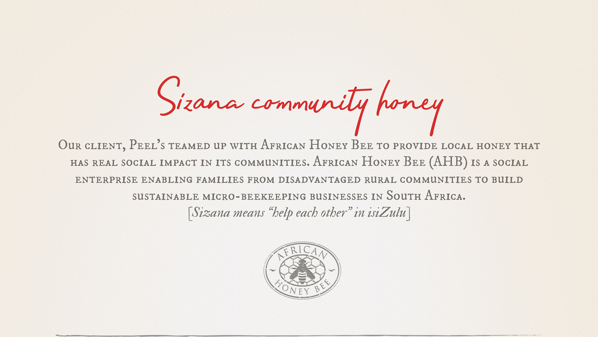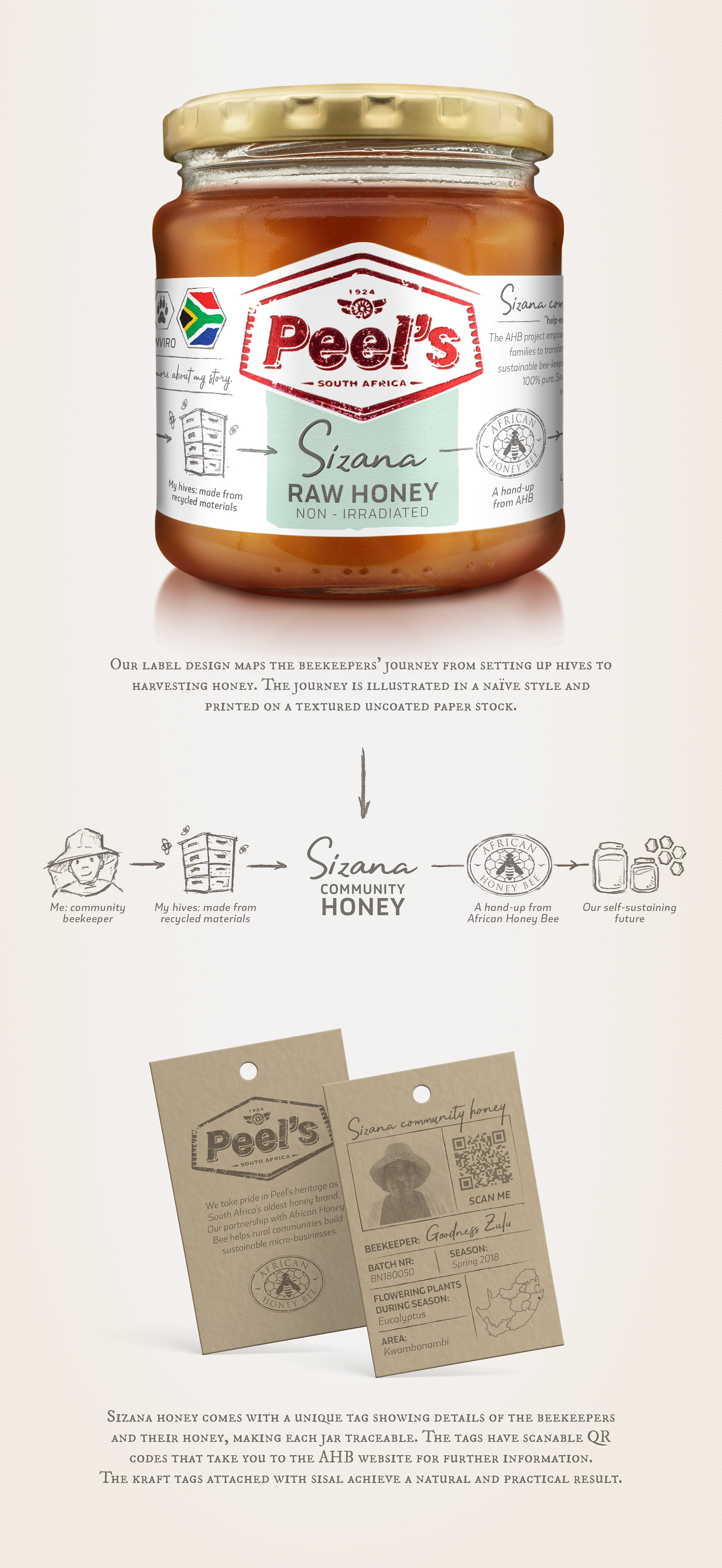
Peel's Sizana HOney
PACKAGING DESIGN | ILLUSTRATION
Gentry Creative was delighted to create packaging design for Peel’s community collaboration with African Honey Bee, an initiative which provides hope for poor communities by equipping them with the tools to create an income. In turn, this initiative provides the consumer with local, traceable honey and an opportunity to support a valuable initiative. Our approach was to make the story central to the product packaging. The label design showcases the journey to financial empowerment through simply sketched icons set along a timeline. Appropriate, as at the heart of the Peel’s brand lies the journey - the Sizana story is an extension of Peel’s own journey. The kraft single-colour neck tag provides the information to fully personalize the product, with the name and face of the community member from whose hives the honey originates. A golden jar of hope anyone?