Spier Seaward Wine Pack Upgrade
Logo Upgrade | Wine Packaging Design
Logo Upgrade | Wine Packaging Design
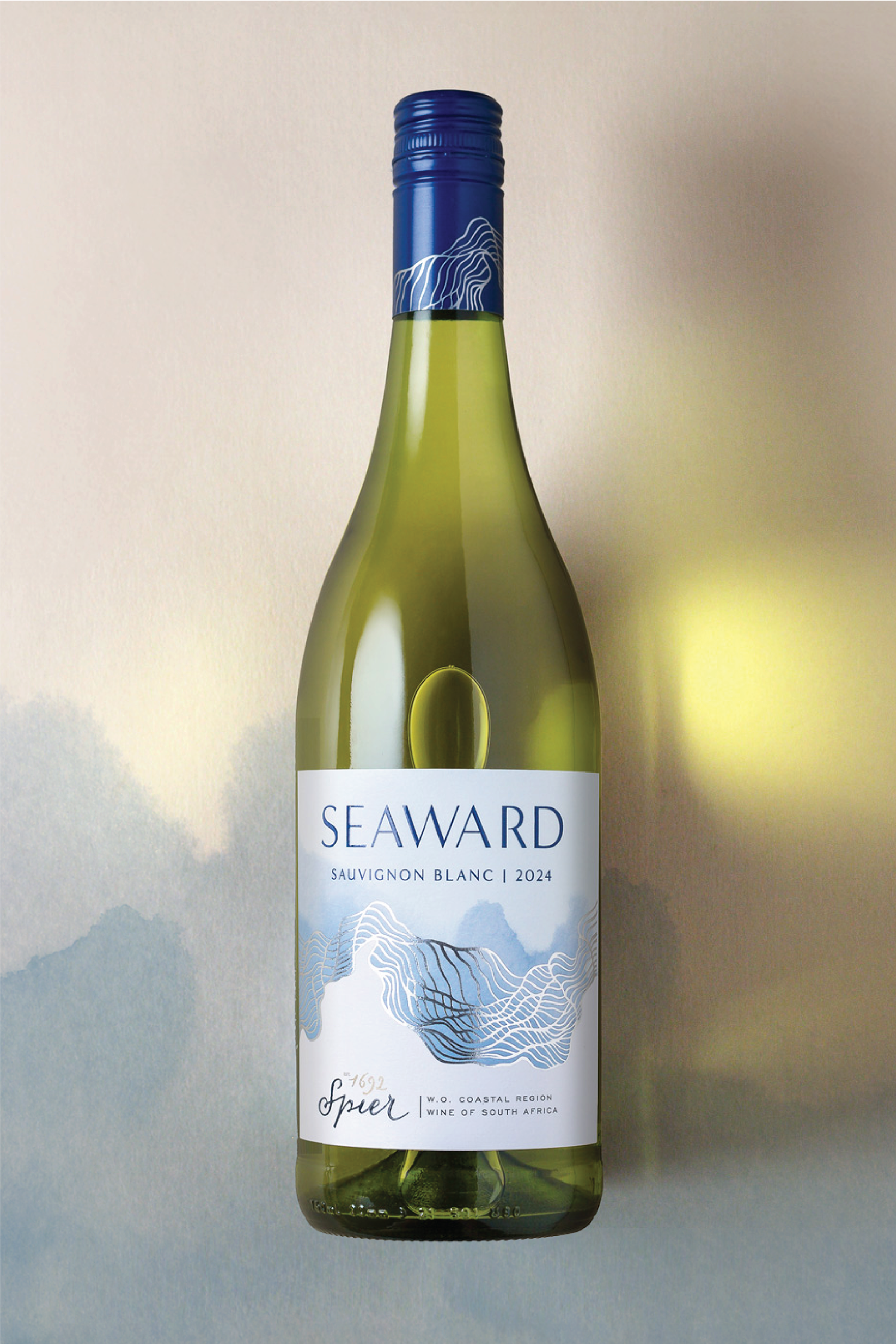
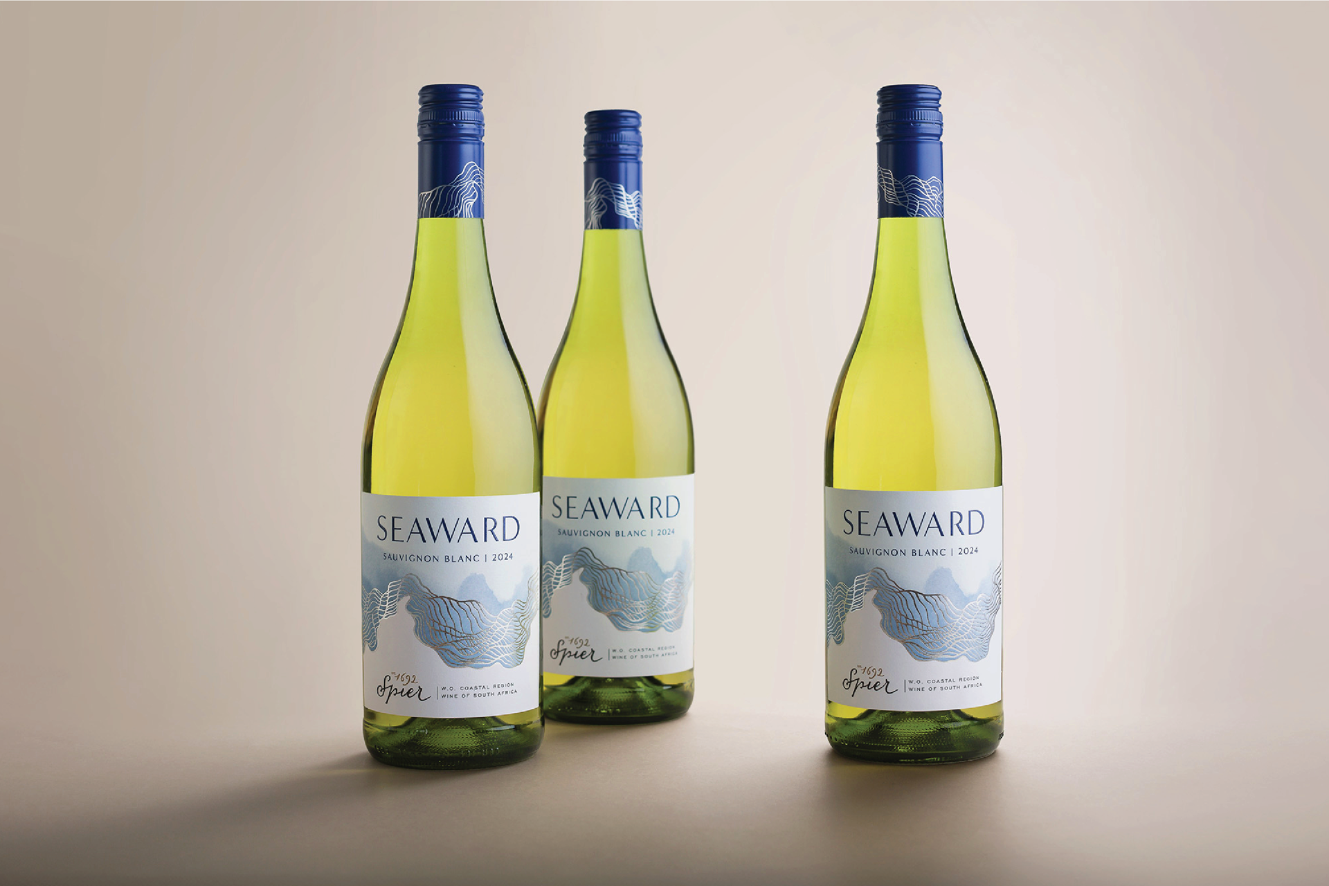
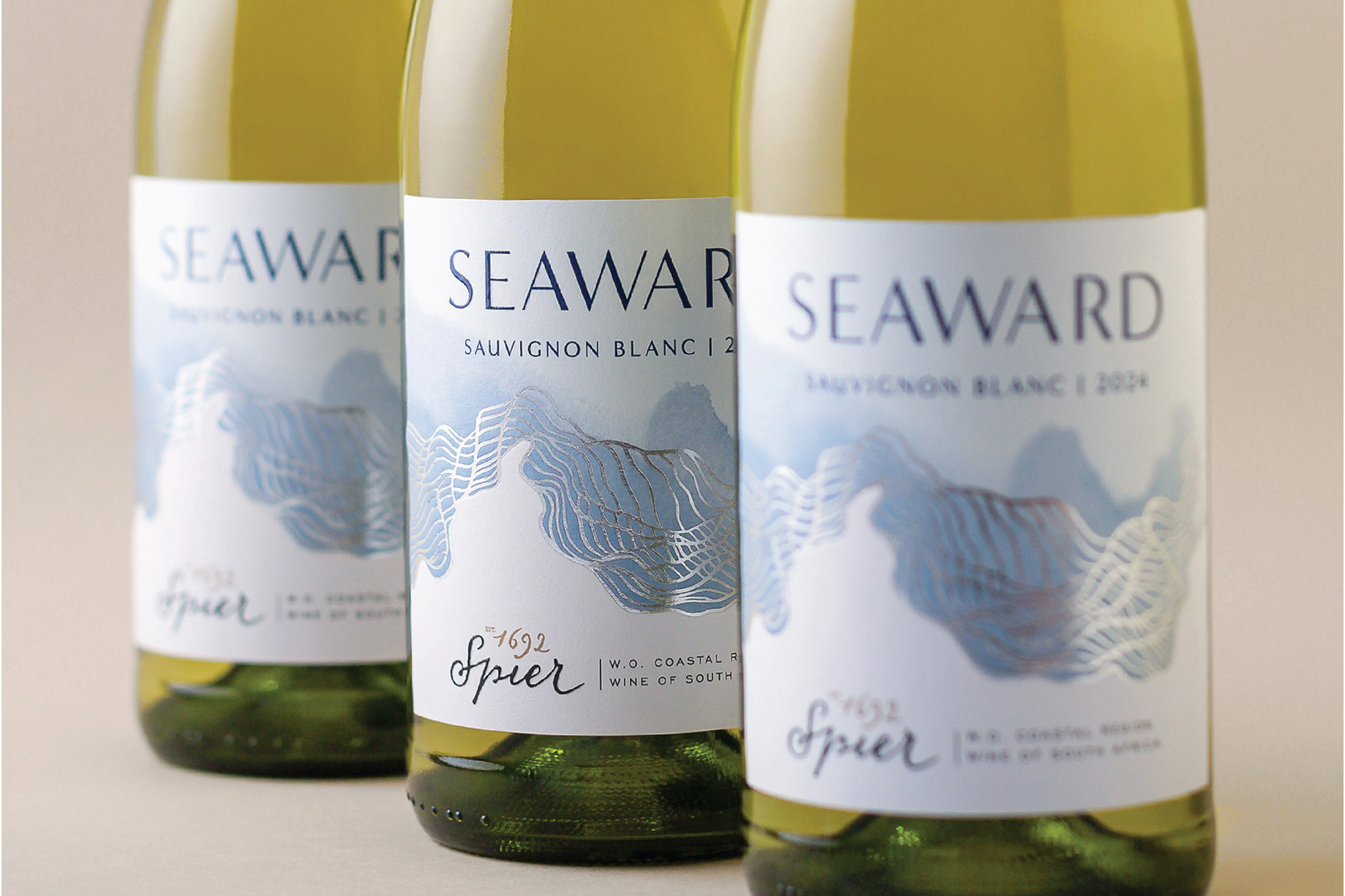
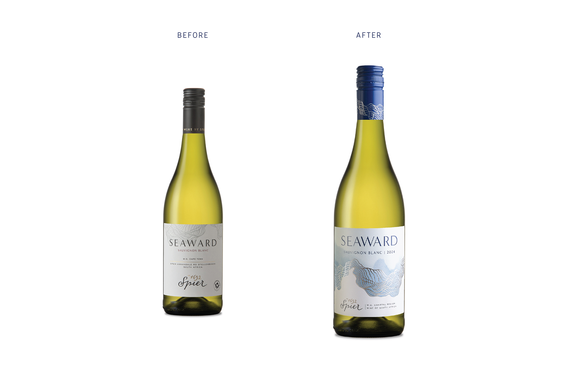
A range of two varietal wines produced by Spier and strongly influenced in style & complexity by the unique Cape coast. To breath freshness into this packaging and reflect the brand concept, without losing Seaward brand recognition, Gentry made use of an existing, but recessive brand asset by placing it front and centre.
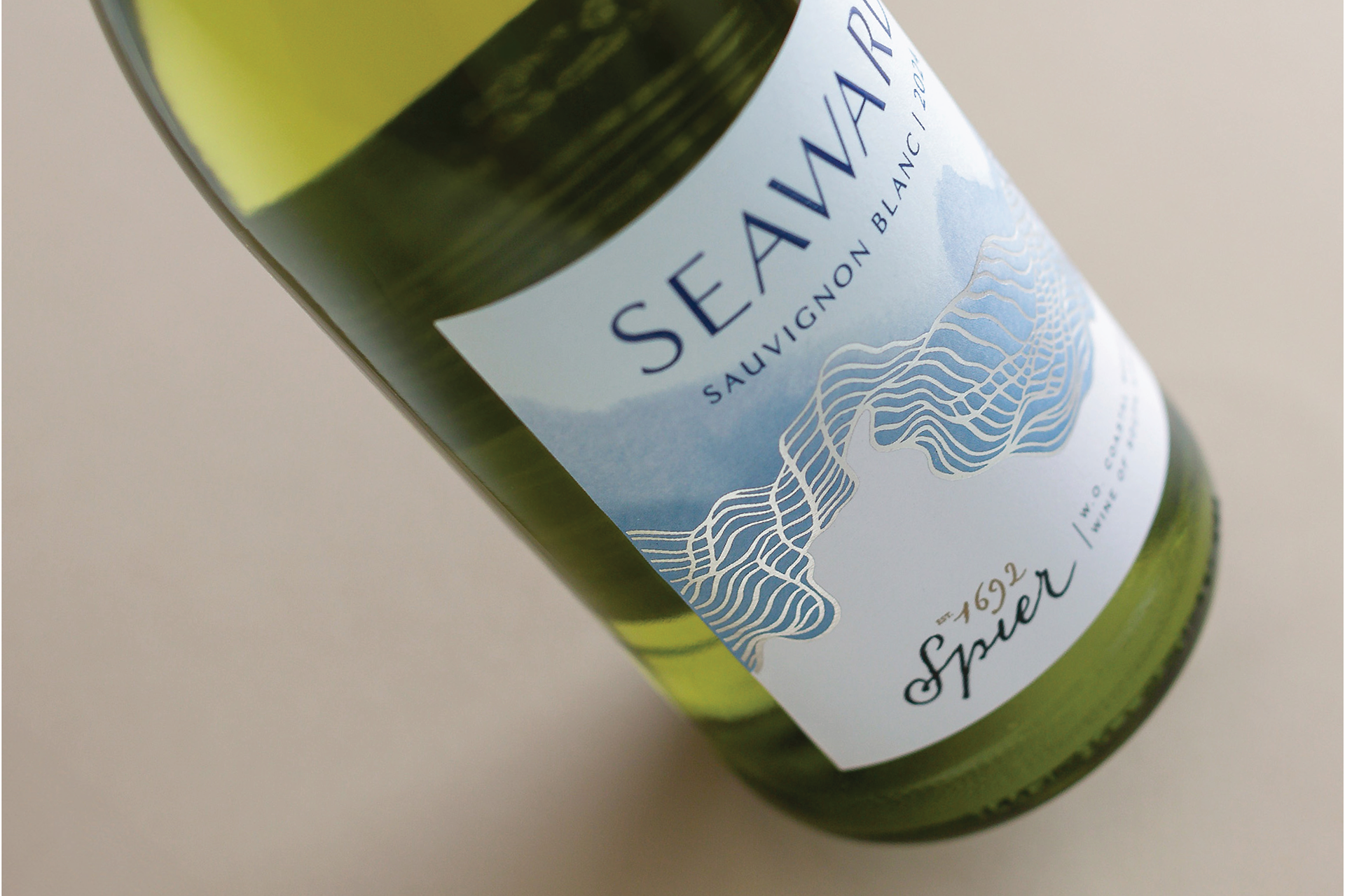
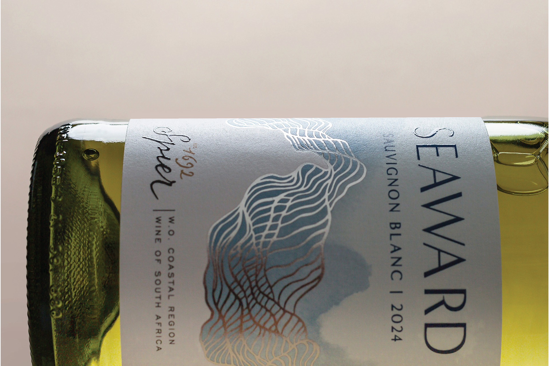
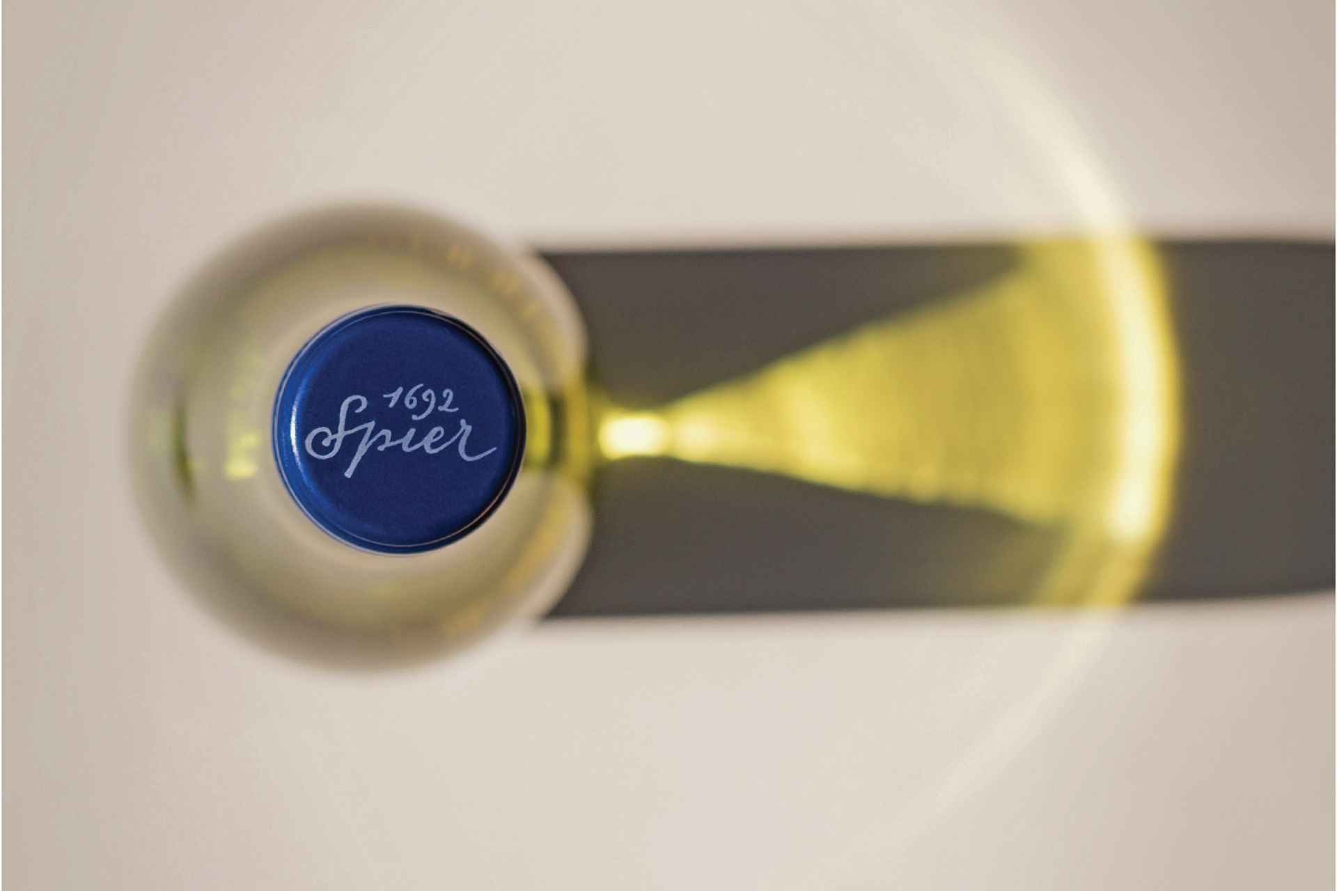
The dynamic pattern was accentuated and premiumised with generous use of fine silver foil, which catches the light as sunlight does on the waves at sea. A pleasing mix of soft blue watercolour tones adds the colour that the pack needed to lift it off the shelf. The pack details are simplified drawing the eye to the new deep blue brand name with varietal directly beneath. A matching vibrant blue closure with bright silver foil waves, completes the reinvigorated new packaging.
