Tangled Tree Wine Pack Upgrade
Logo Upgrade | Wine Packaging Design
Logo Upgrade | Wine Packaging Design
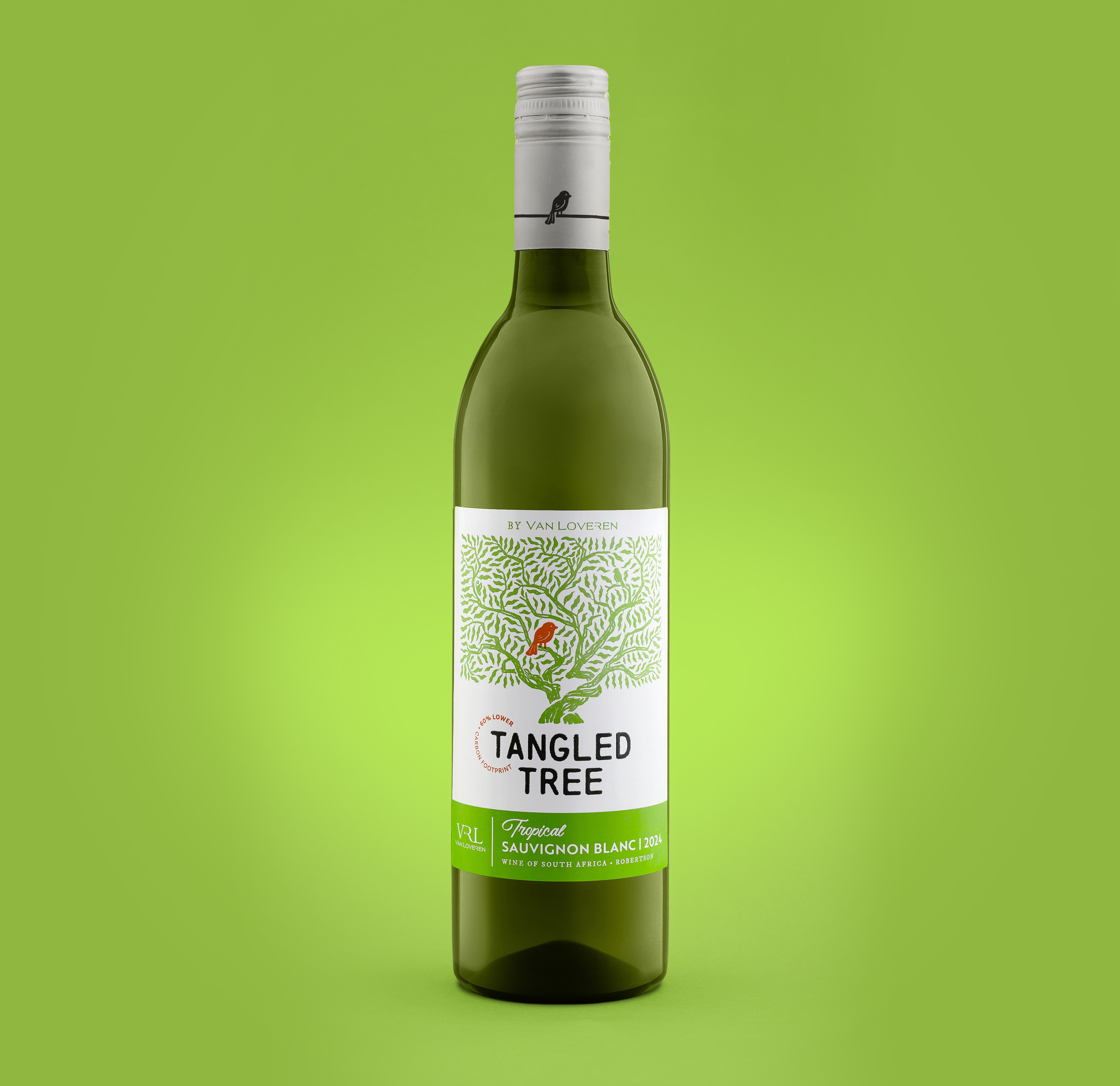
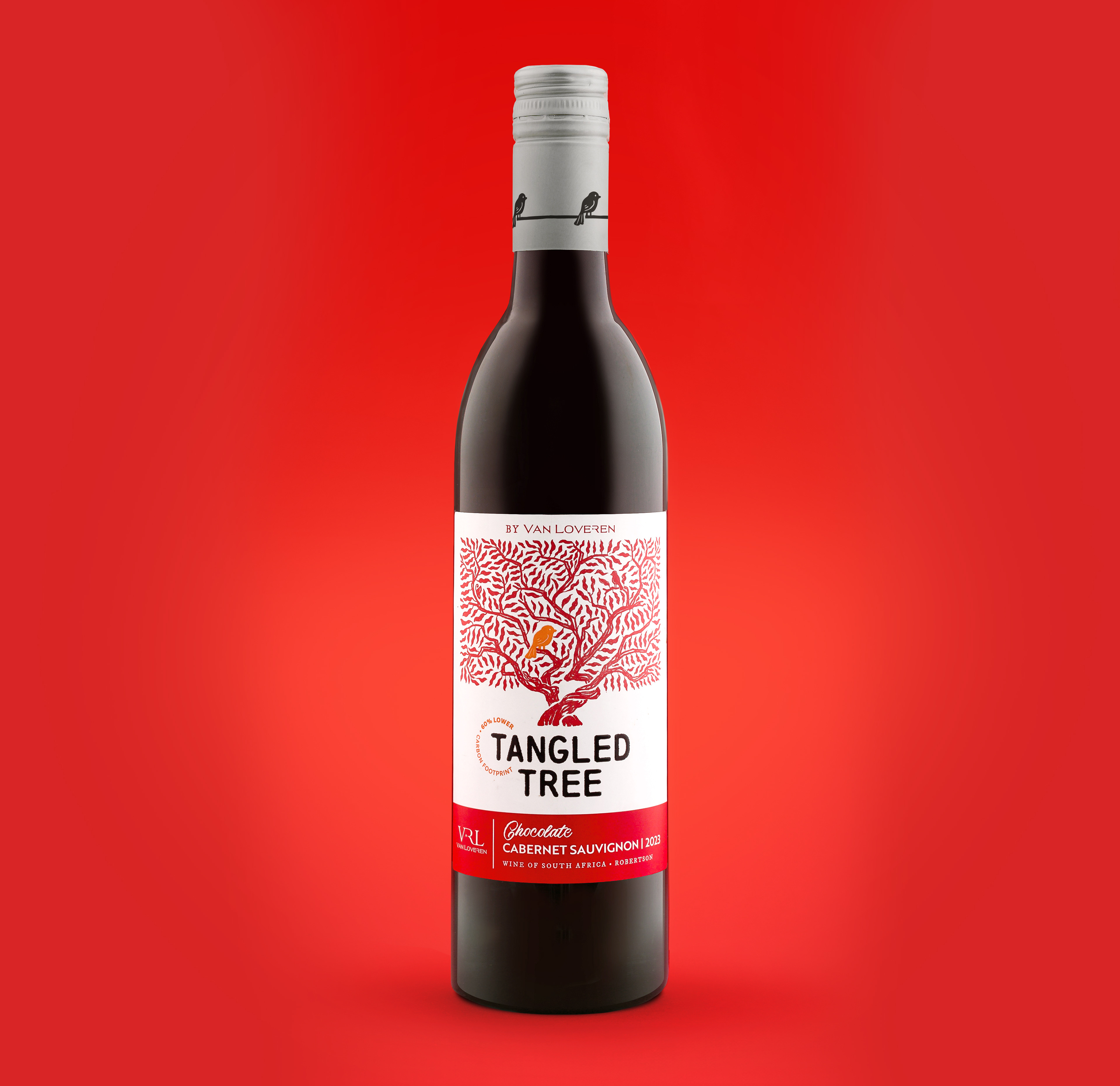
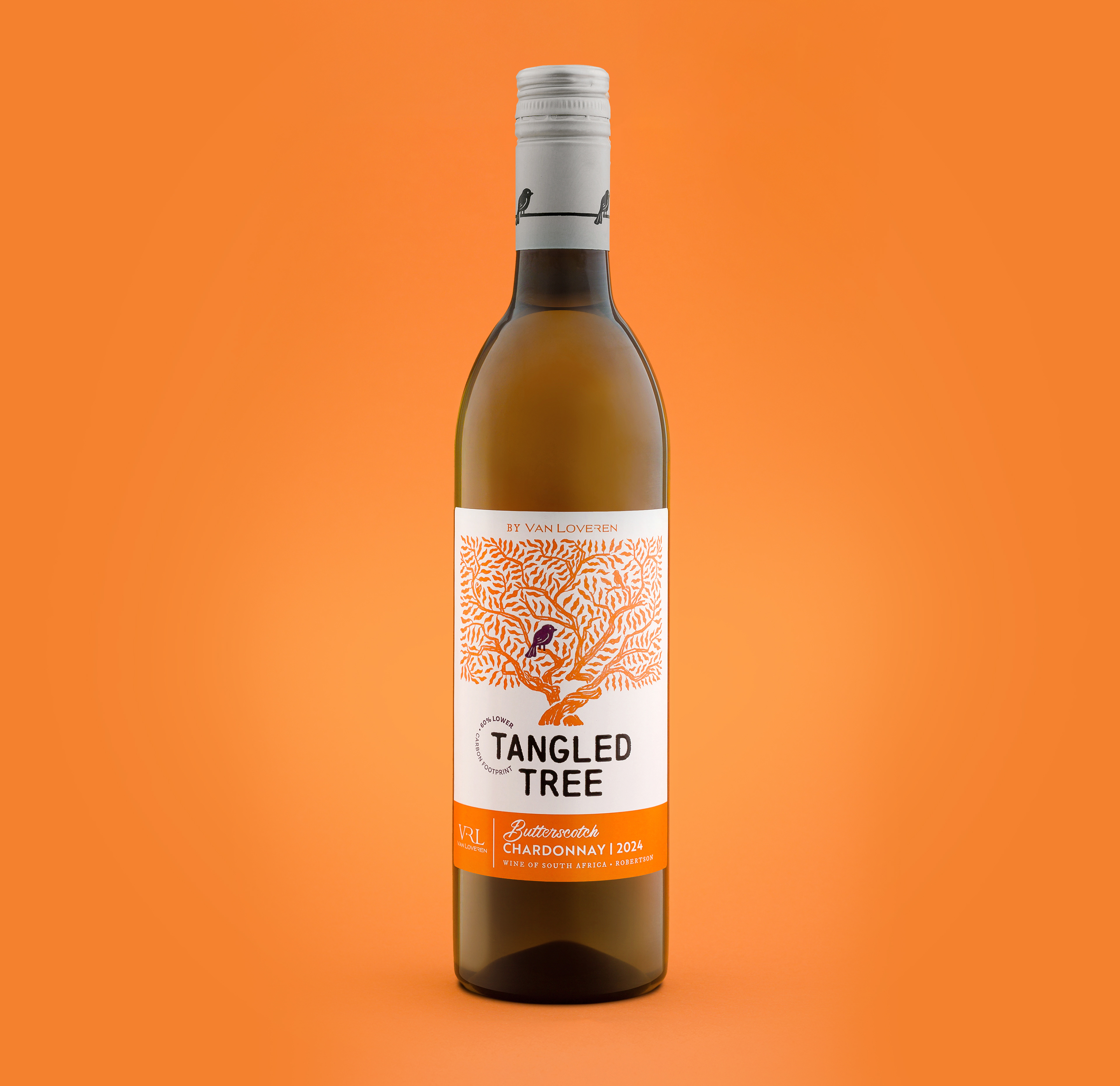
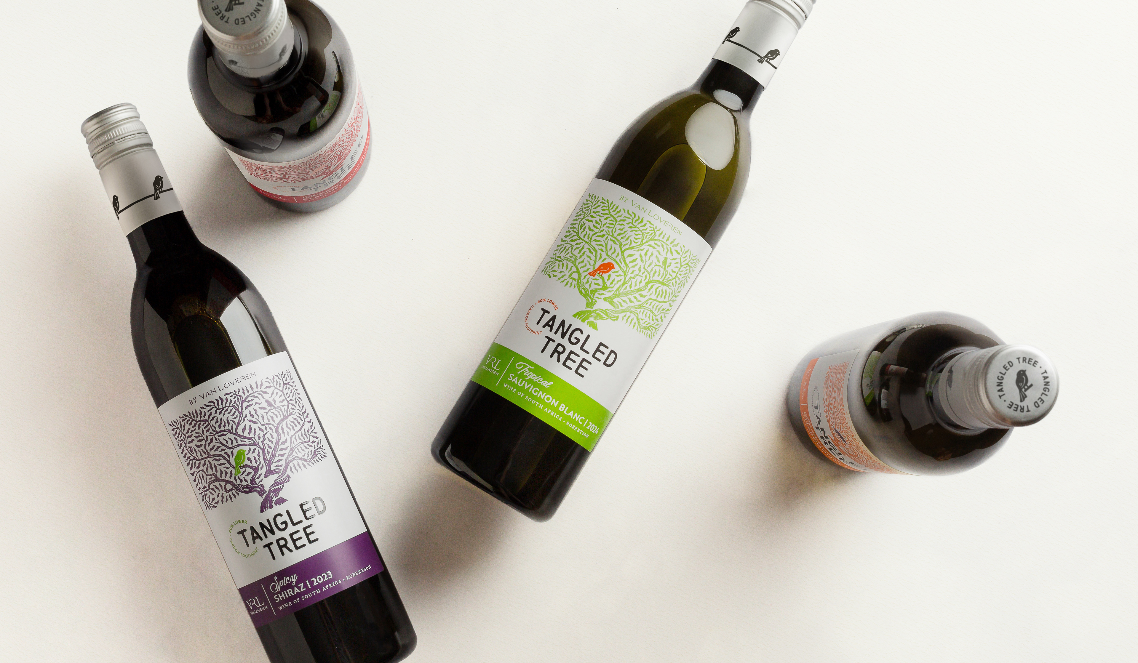
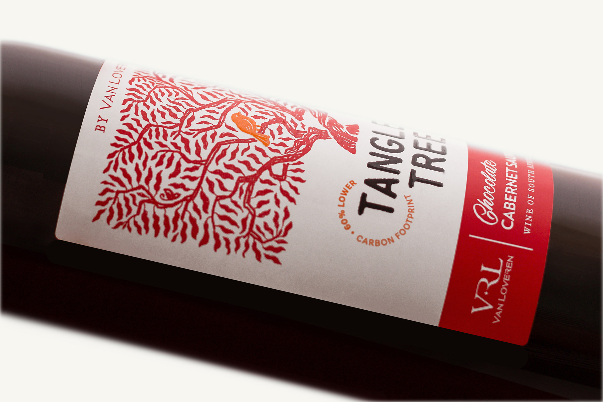
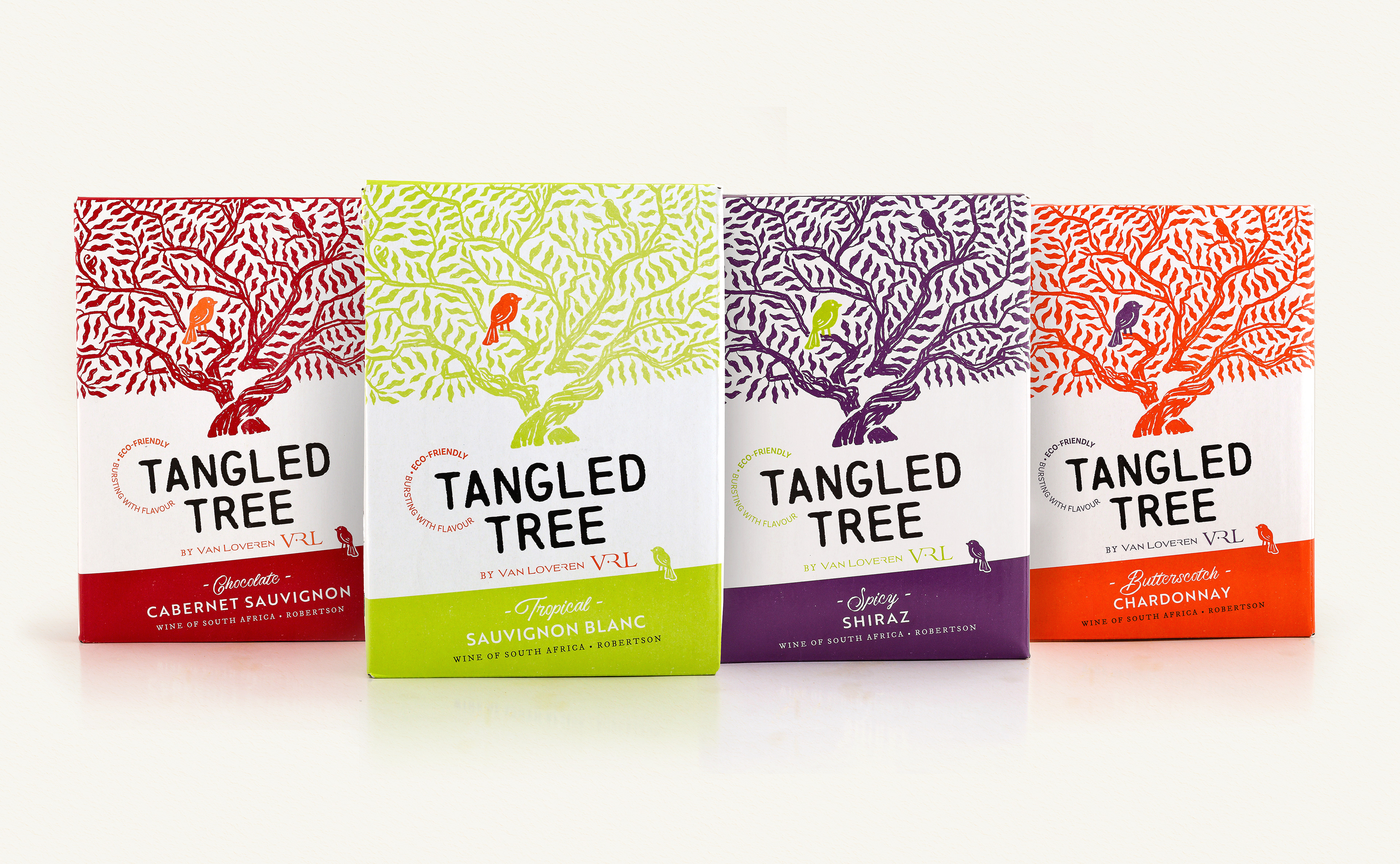
Tangled Tree wines – a well known and loved range especially appreciated for its durable, light-weight bottles and lower carbon footprint. Most people don’t know that the tangled tree actually exists and grows still in the gardens of Van Loveren. What’s more, the two identical and interwoven trees have a story rooted in the 1940’s and have come to represent the marriage of the couple that planted the trees, and a life spent side by side.
Gentry’s creative challenge was to inject authenticity and some nostalgia into the label, whilst refreshing and modernizing the existing distinctive Tangled Tree iconography.
Departing from the current static tree icon, Gentry’s tree illustration was hand-drawn in pencil, providing a softer whimsical effect that stretches up and fills the space. The current pack is known for the single iconic bird, which needed to be retained, but if you look closely, you will see there is second bird in the tangled tree. An improved paper spec and the use of Highbuild varnish for accent premiumises the pack. The wordmark and bright colour palette were retained as they provide vital standout and variant navigation at this price point. The order of information also remains unchanged, so the upgrade appears evolutionary for the consumer, while delivering a revolutionary end result.
