Almost Zero De-alcoholised Wine Pack Upgrade
Logo Upgrade | Wine Packaging Design
Logo Upgrade | Wine Packaging Design
How do you fix a #1 category hero with distinctive, but limiting packaging?
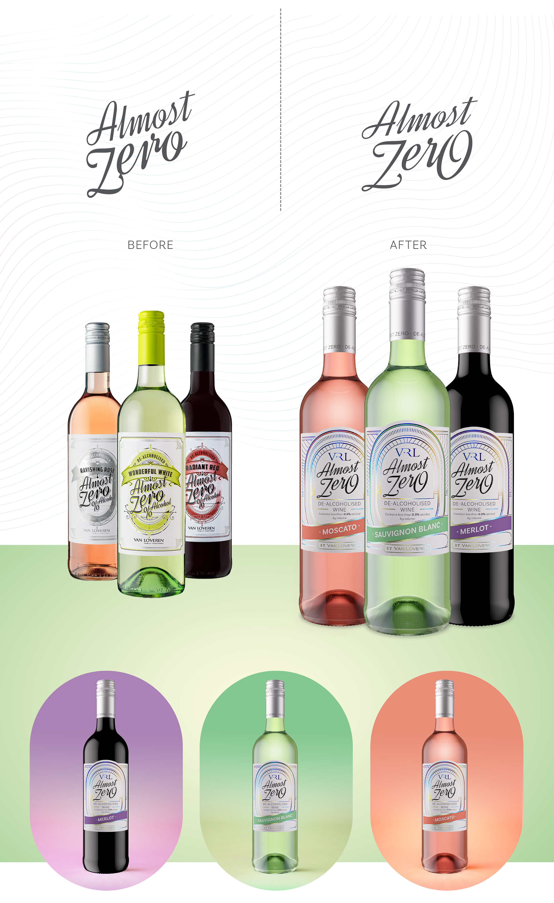
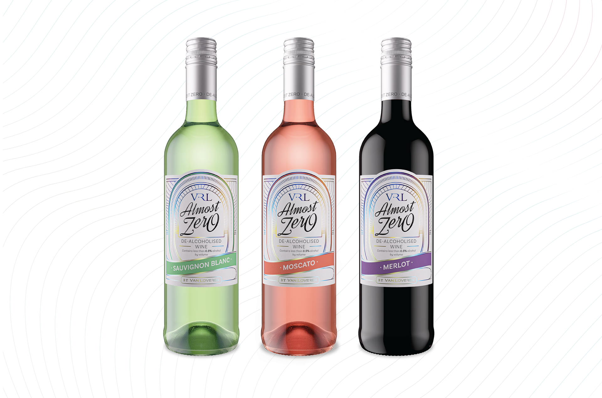
Almost Zero was launched in 2020 at the outset of Covid (during the SA alcohol ban) and holds the number one position in the South African non-alcoholic wine category. Almost Zero was first to market when a category packaging style was not yet established in the local market. Almost Zero’s craft beer label image was initially beneficially disruptive, easily setting it apart from wines containing alcohol. However, as the category matured, this distinctive look has dated and lacks the finesse sober curious consumers are seeking for enjoyment at adult drinking occasions.
Gentry Creative’s challenge was to create fresh new packaging that would maintain brand recognition, whilst delivering wholesale change.
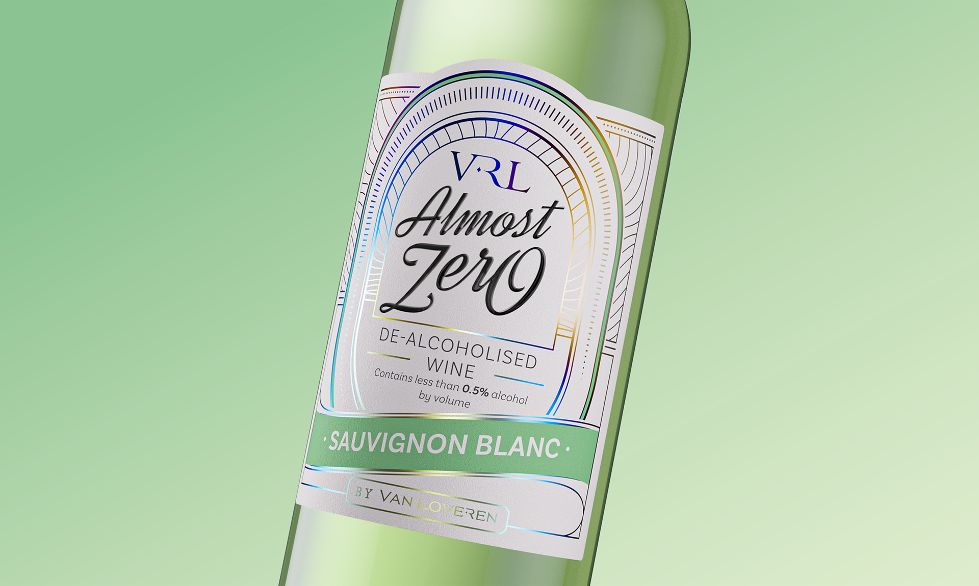
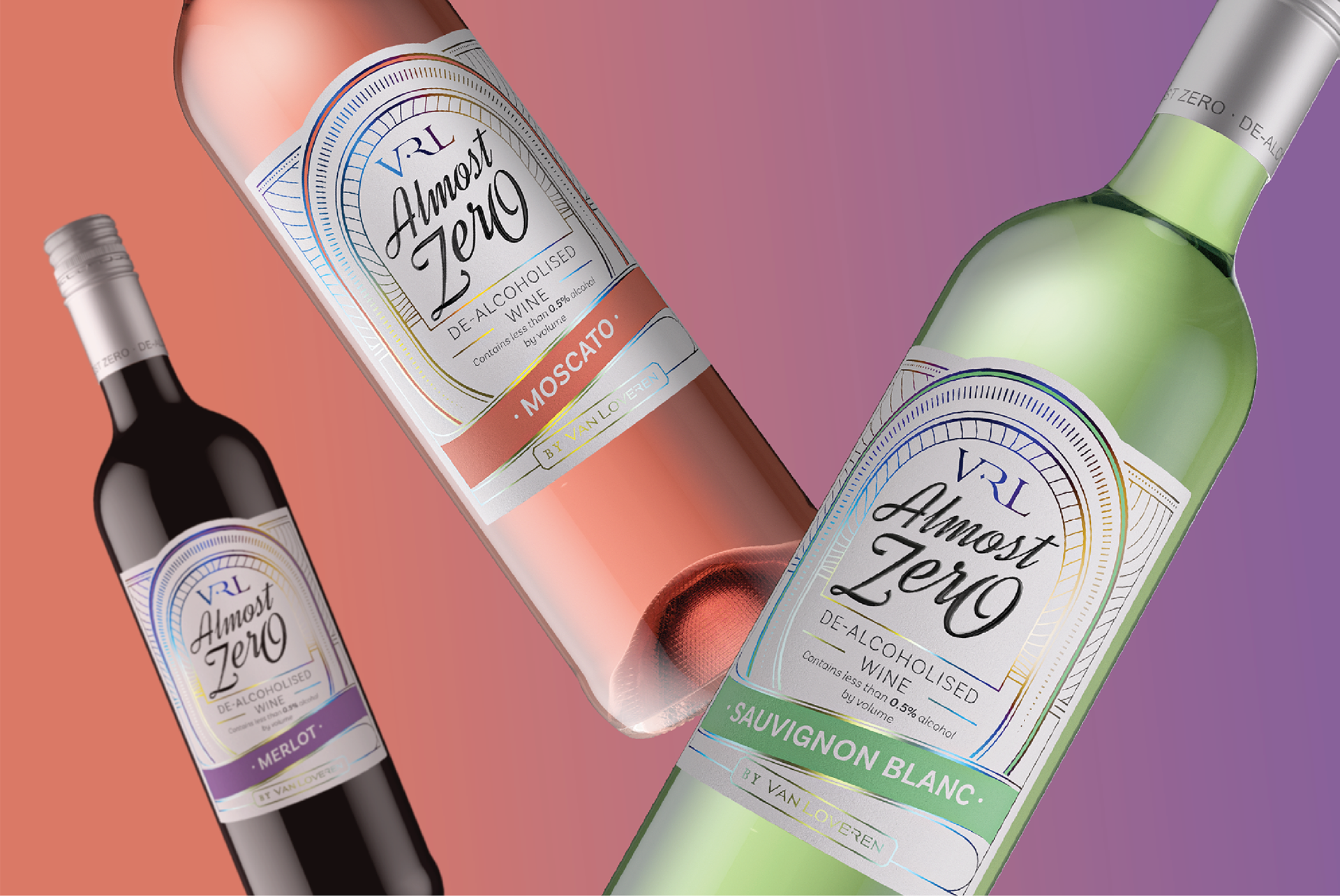
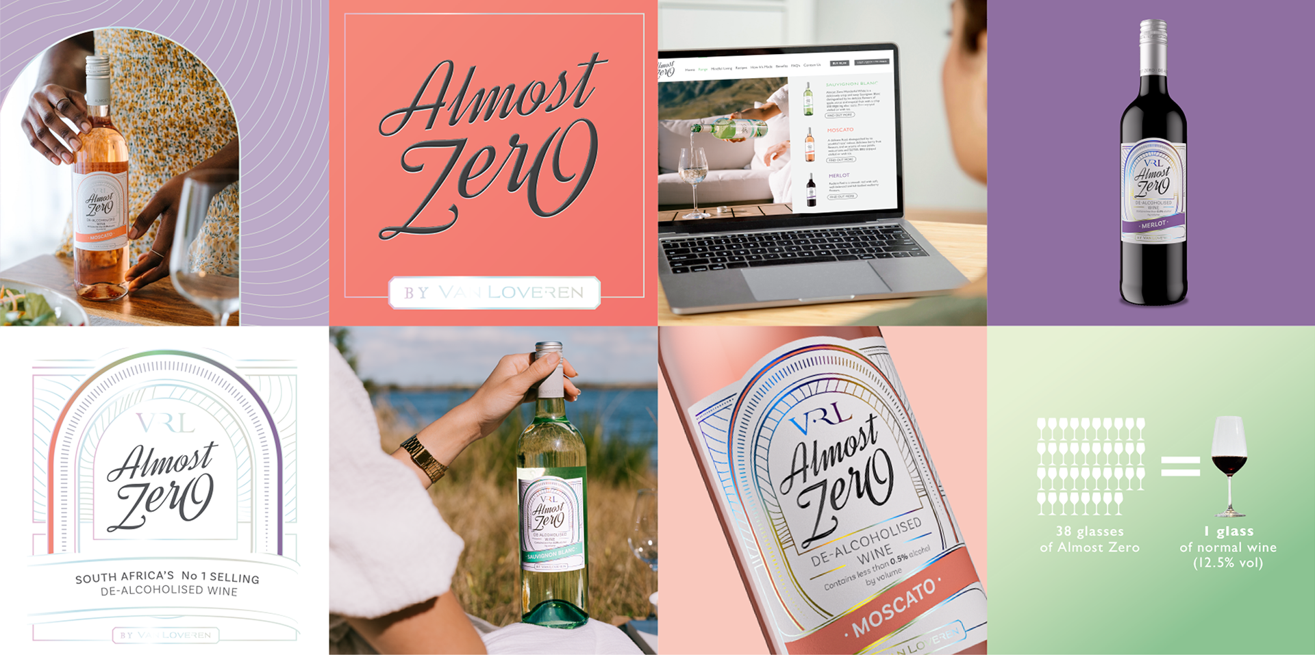
To this end, Gentry maintained the masculine angular logo font and beer “race-track” architecture, still further enlarging this to create a shaped label. The changing of the order of information on the label and the use of a more current and sophisticated colour palette infused the cool easy elegance this packaging needed.
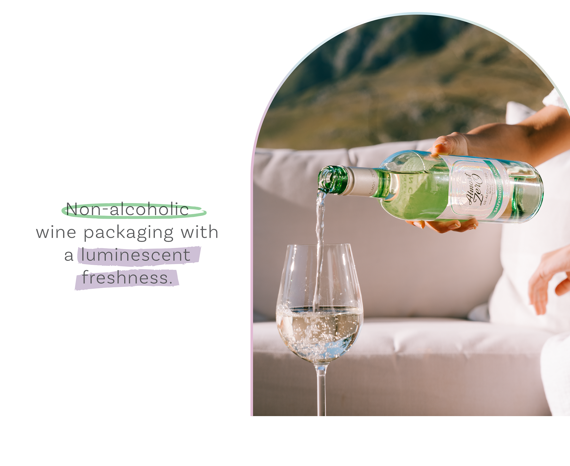
To continue the innovation for which the brand is known, Gentry Creative introduced a holographic foil in all the label linework. The result is a luminously light and refreshing range of wines. The connection to the original packaging is maintained without compromising a softer and more contemporary fresh new look.
Renders by Prince Boliwe
https://www.behance.net/Princesb