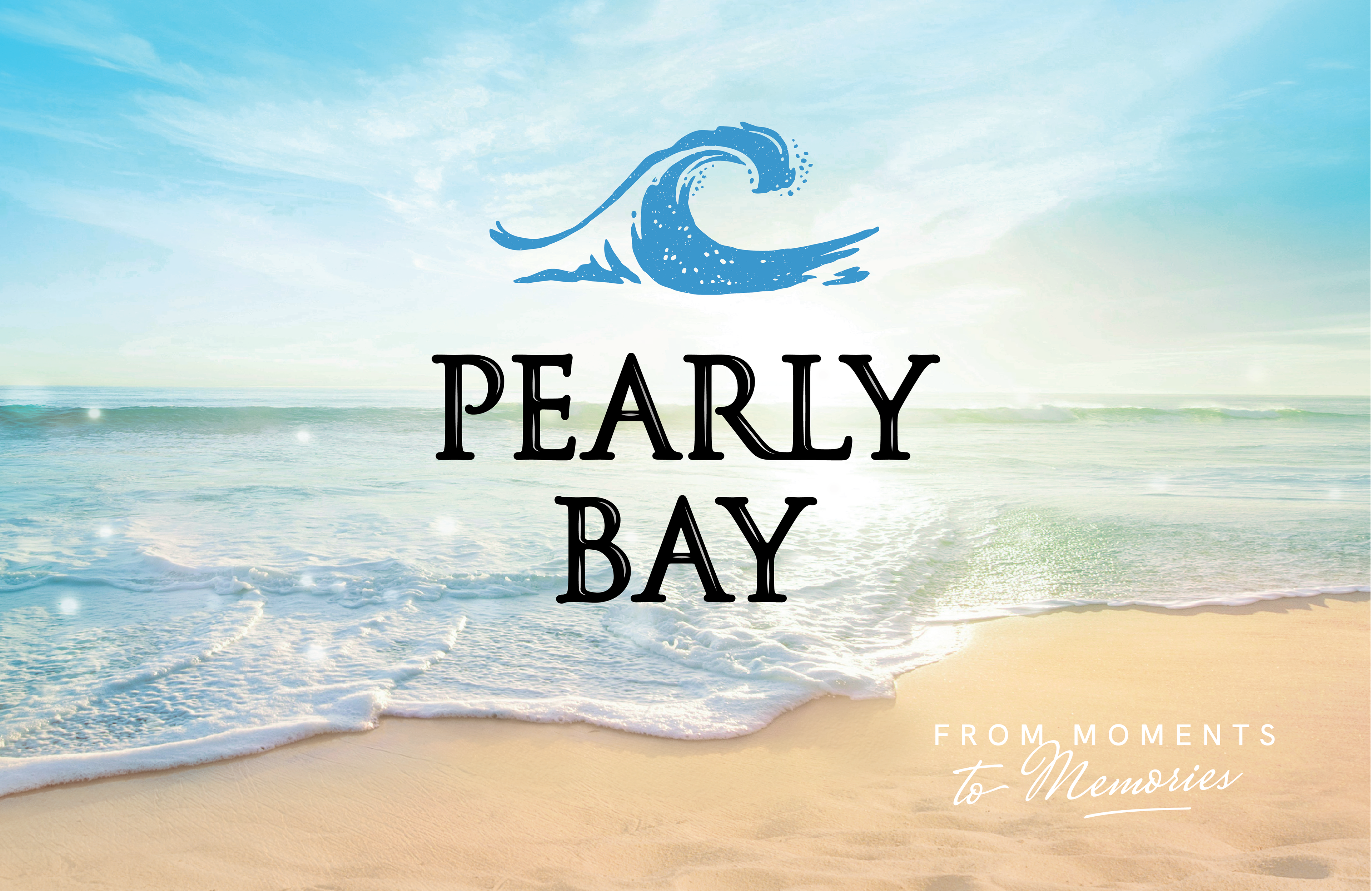
Pearly Bay
Wine Packaging Design | Packaging Upgrade | Branding
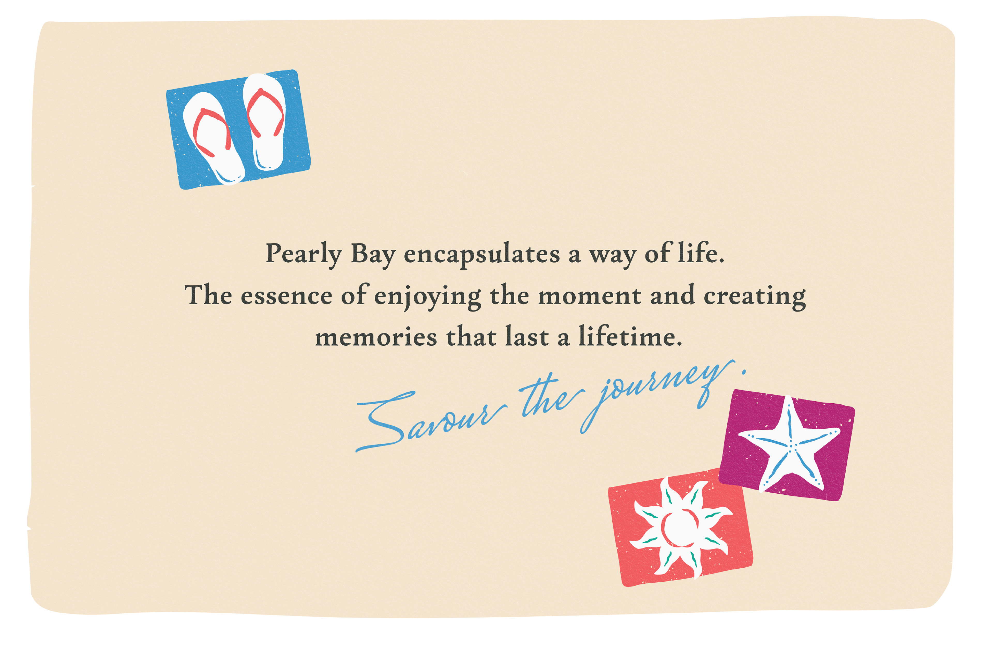
How do you package a moment in time?
Pearly Bay, the brand for moments and memories, celebrates and toasts those beautiful moments by the sea that become our cherished memories.
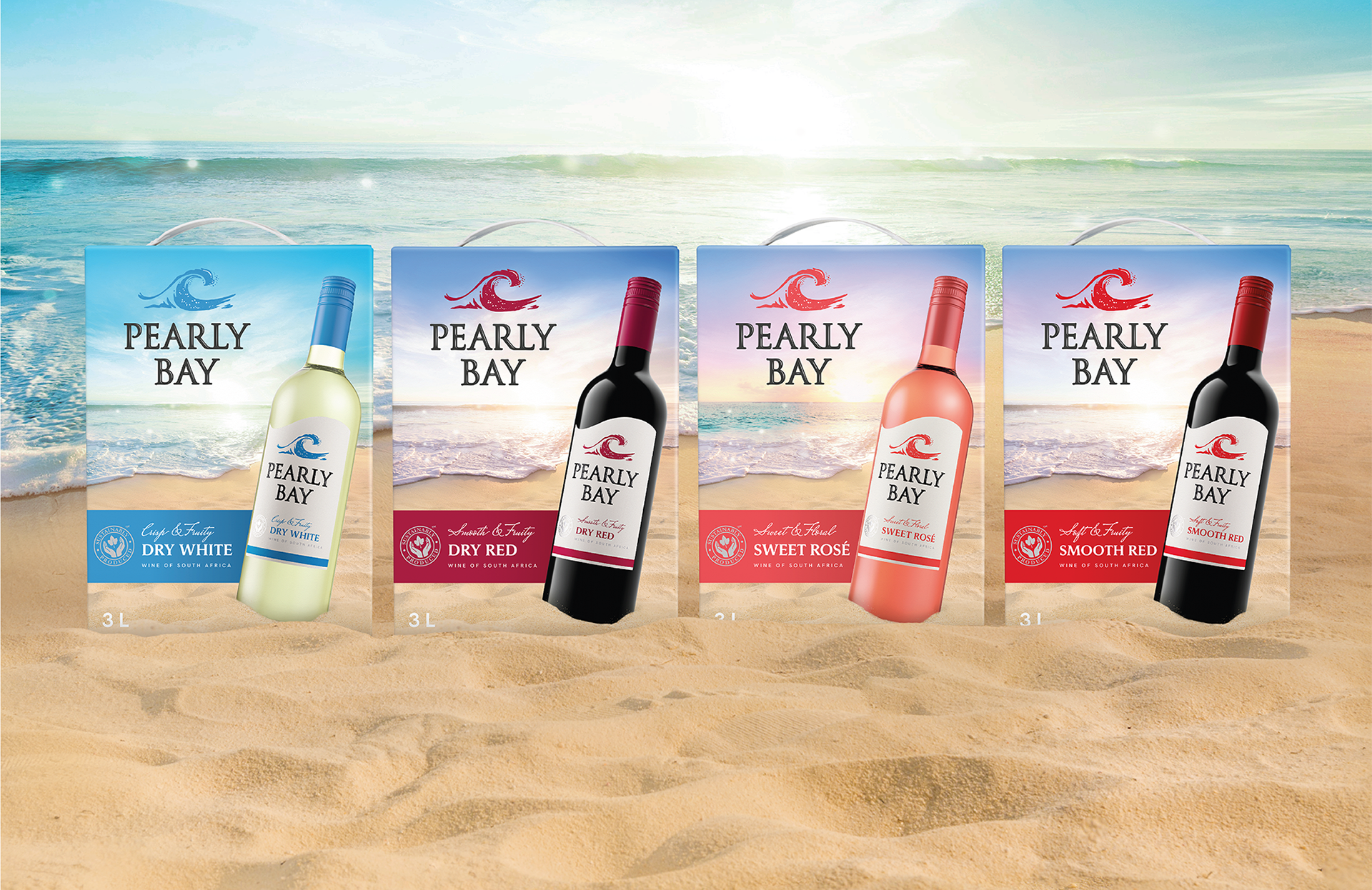
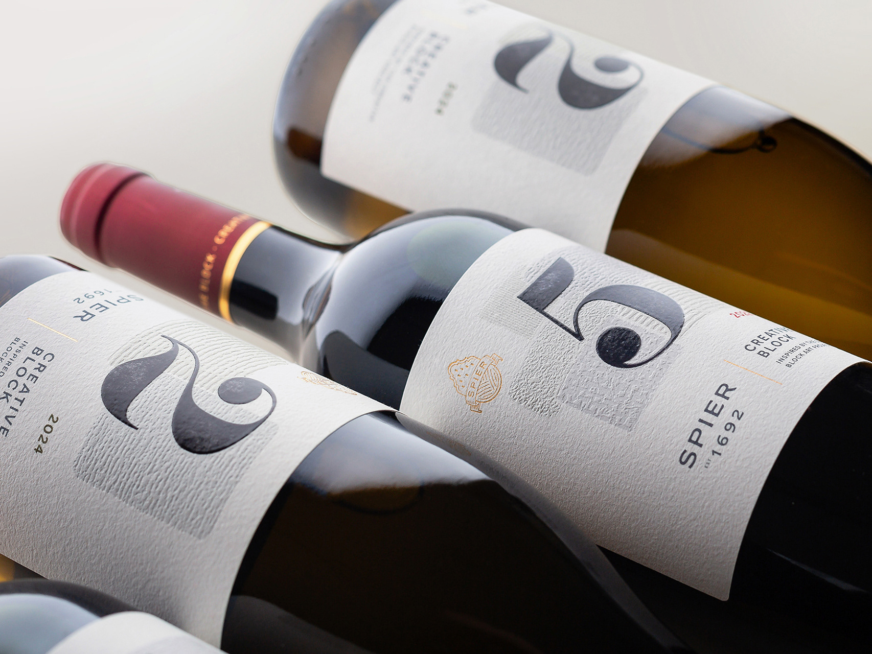
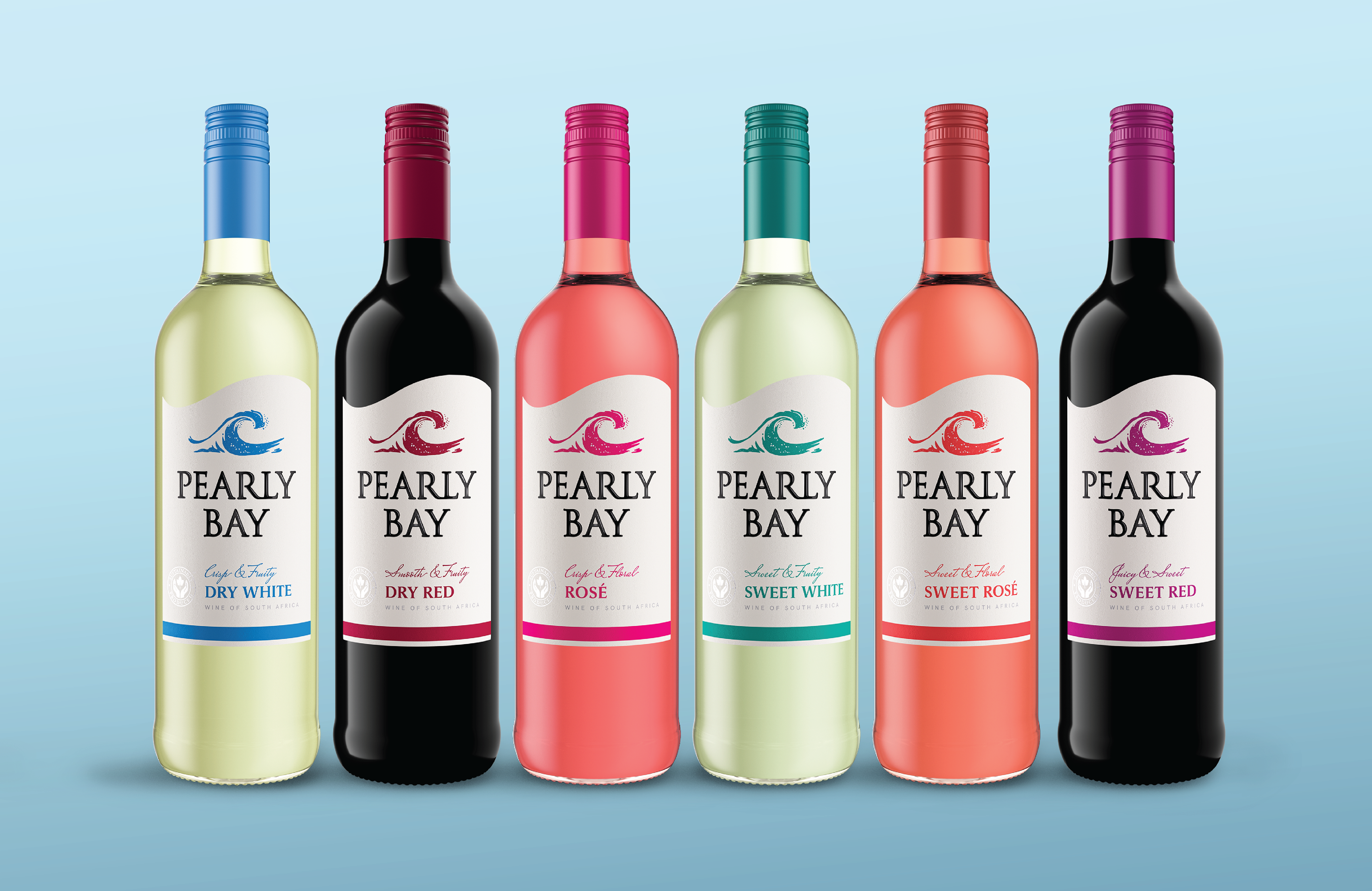
Produced by KWV, the range of nine wines is sold in South Africa, Africa, Europe and Canada.
Produced by KWV, the range of nine wines is sold in South Africa, Africa, Europe and Canada.
Our team was tasked with updating the Pearly Bay visual identity and upgrading the packaging across formats: label, bag-in-box, tetra pack and sparkling wine.
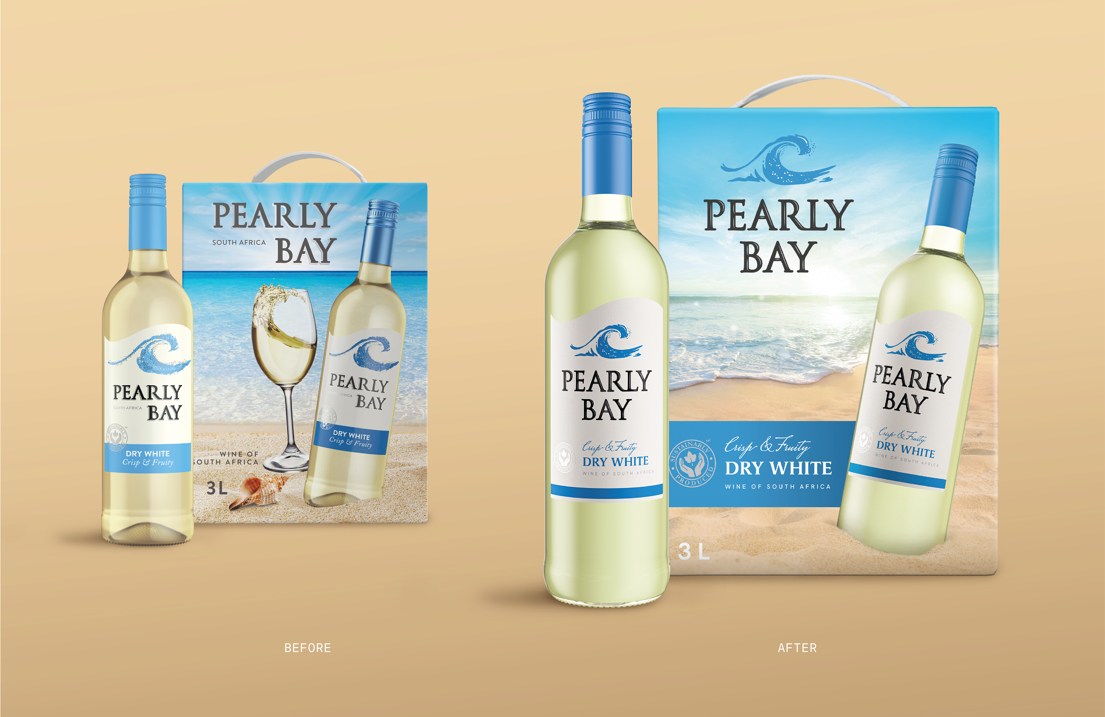
The bag-in-box format provides the ideal “billboard” for framing that moment on the pearly-white sand, gazing into the sparkling water of the bay beyond. The brand hero, Dry White epitomizes a crisp sunny afternoon, whilst the lead visuals for the remaining three bag-in-box wines in the range evoke three additional relatable moments in the day.
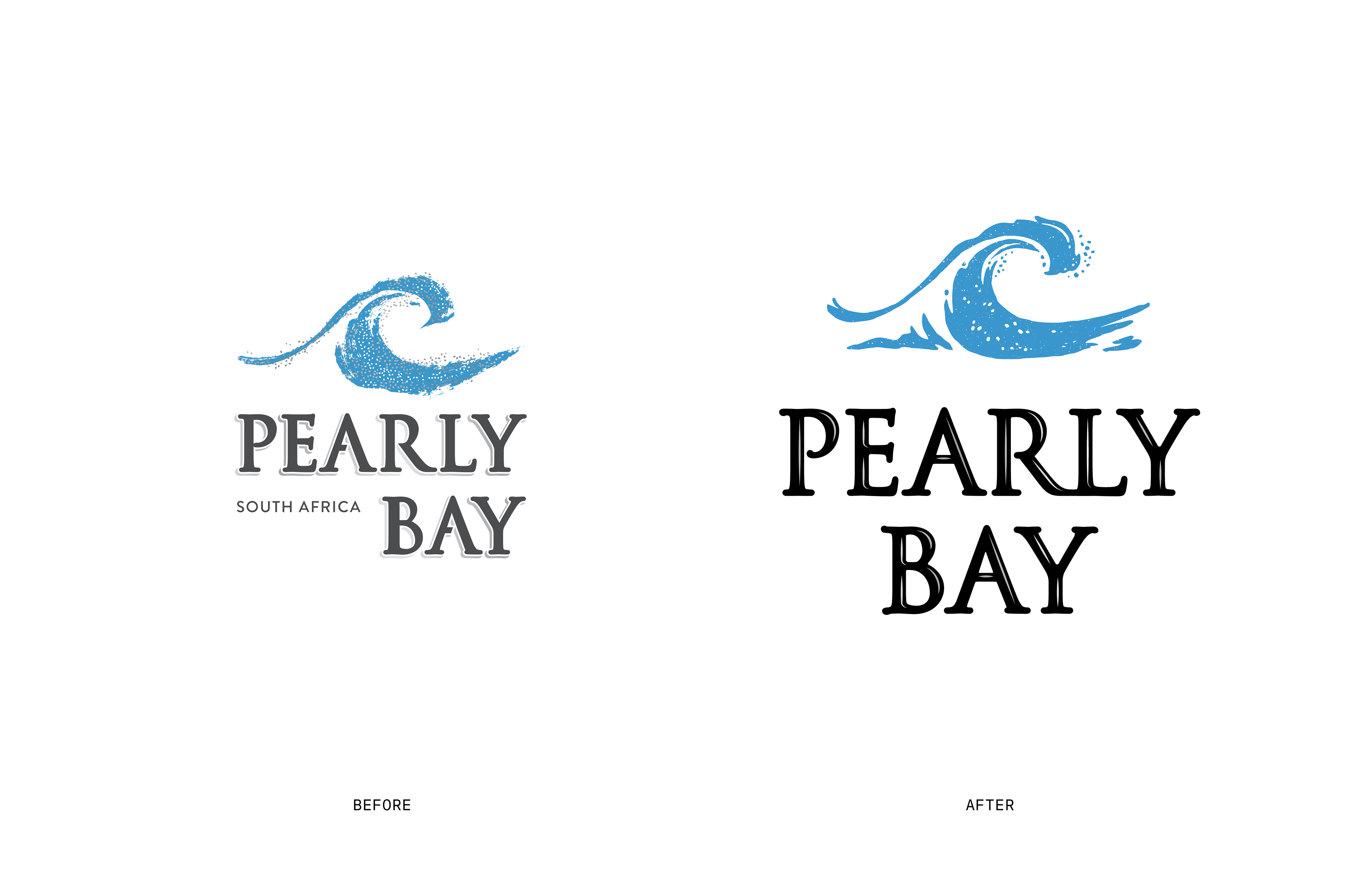
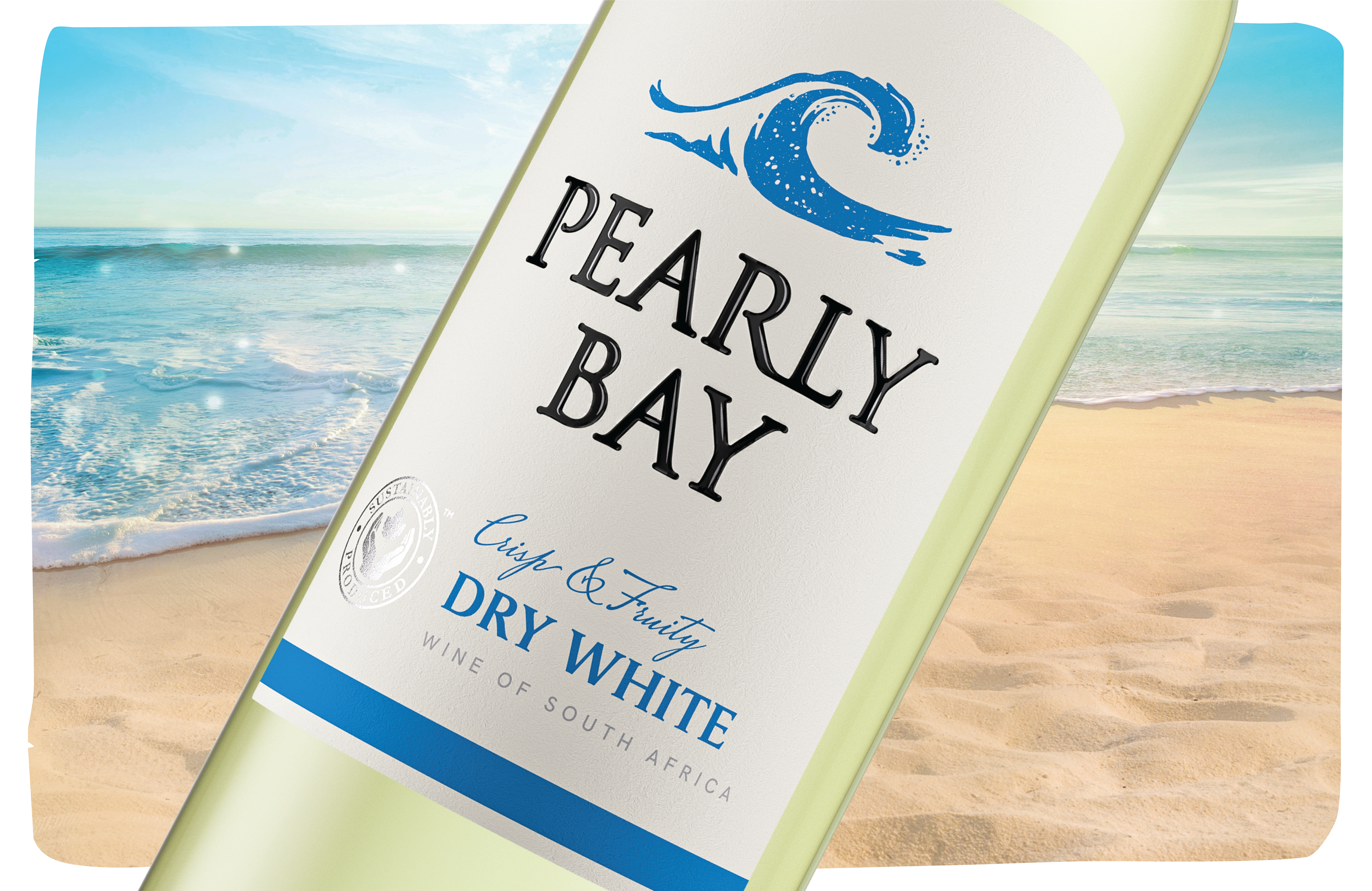
We refined the Pearly Bay brand logotype, updating the lettering, addressing irregularities, and adding a smooth highlight for a more polished result.
We recreated the wave seal with crisper lines, directional sea-spray, and ocean context. These changes set the scene for a centered logo lockup with easier universal application and optimal use of pack space.
The end result is a strikingly confident, but friendly brand with desirable and relatable imagery.