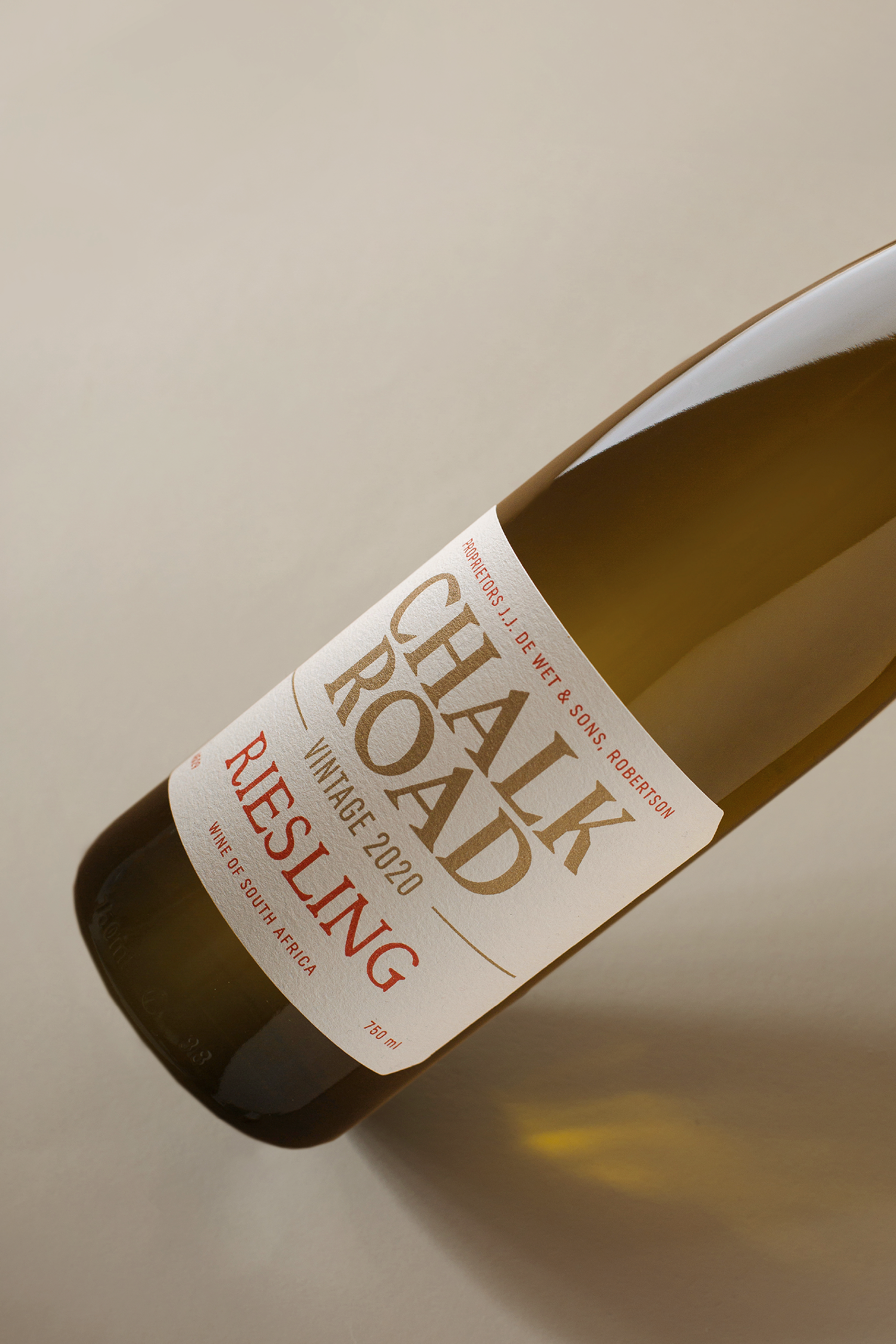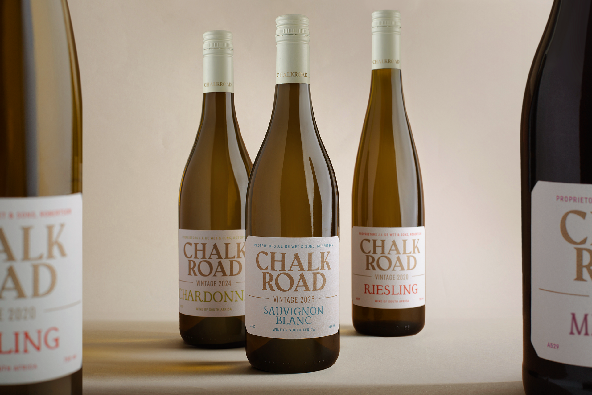
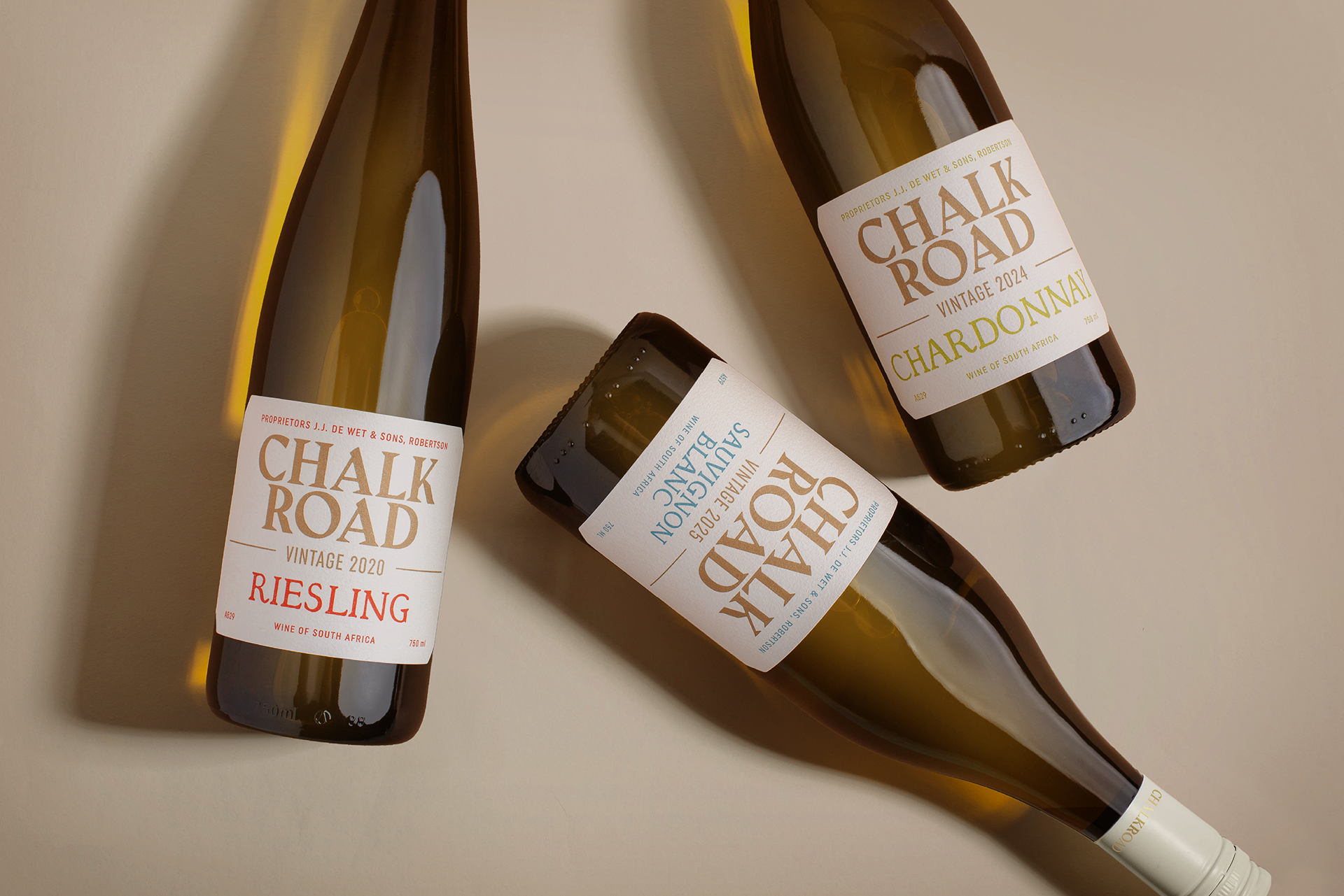
Chalk Road
Brand Concept | Packaging Design
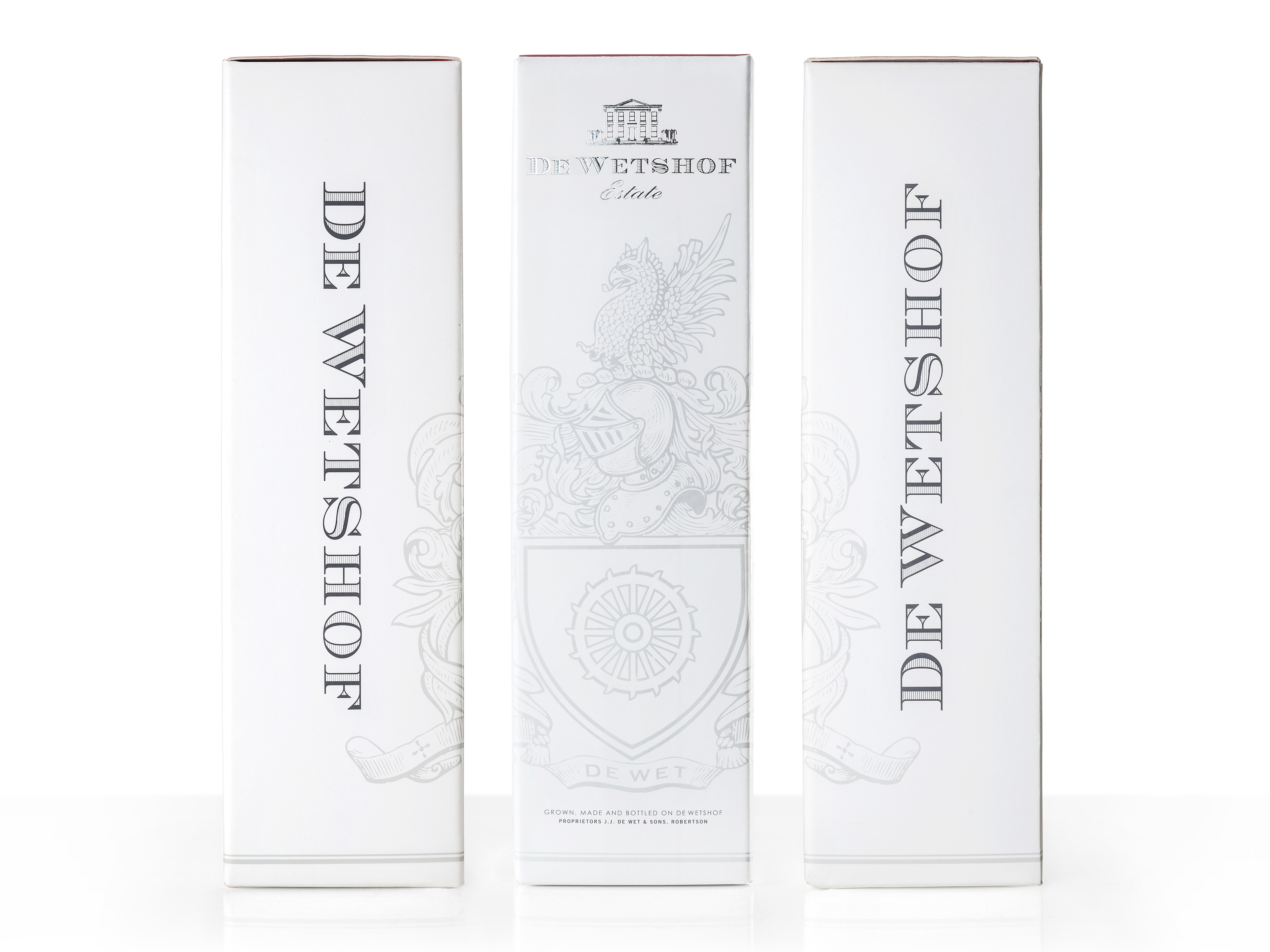
Chalk Road – From Imagination, a Sense of Place
Born from De Wetshof’s chalk-rich soils, Chalk Road began as an idea – a name without a map, a story waiting to be told. Our task was to give it depth, texture, and identity: to make something that feels as real as the land itself. Packaging that honours its South African origin while nodding to the timeless appeal of French Burgundian wines.
Our approach was to craft an identity that feels authentic, contemporary, and quietly confident. The design draws inspiration from the textures and tones of the land – the soft chalk of the soil, the haze that lingers over the vineyards, and the muted palette of an autumn afternoon.
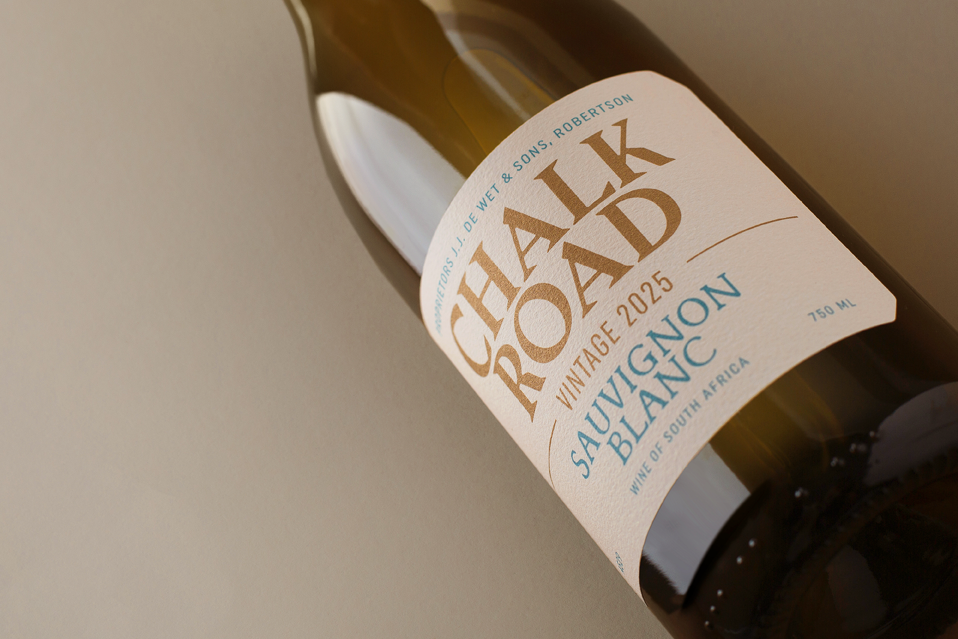
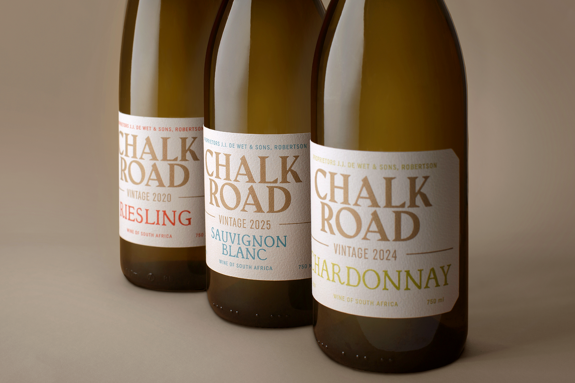
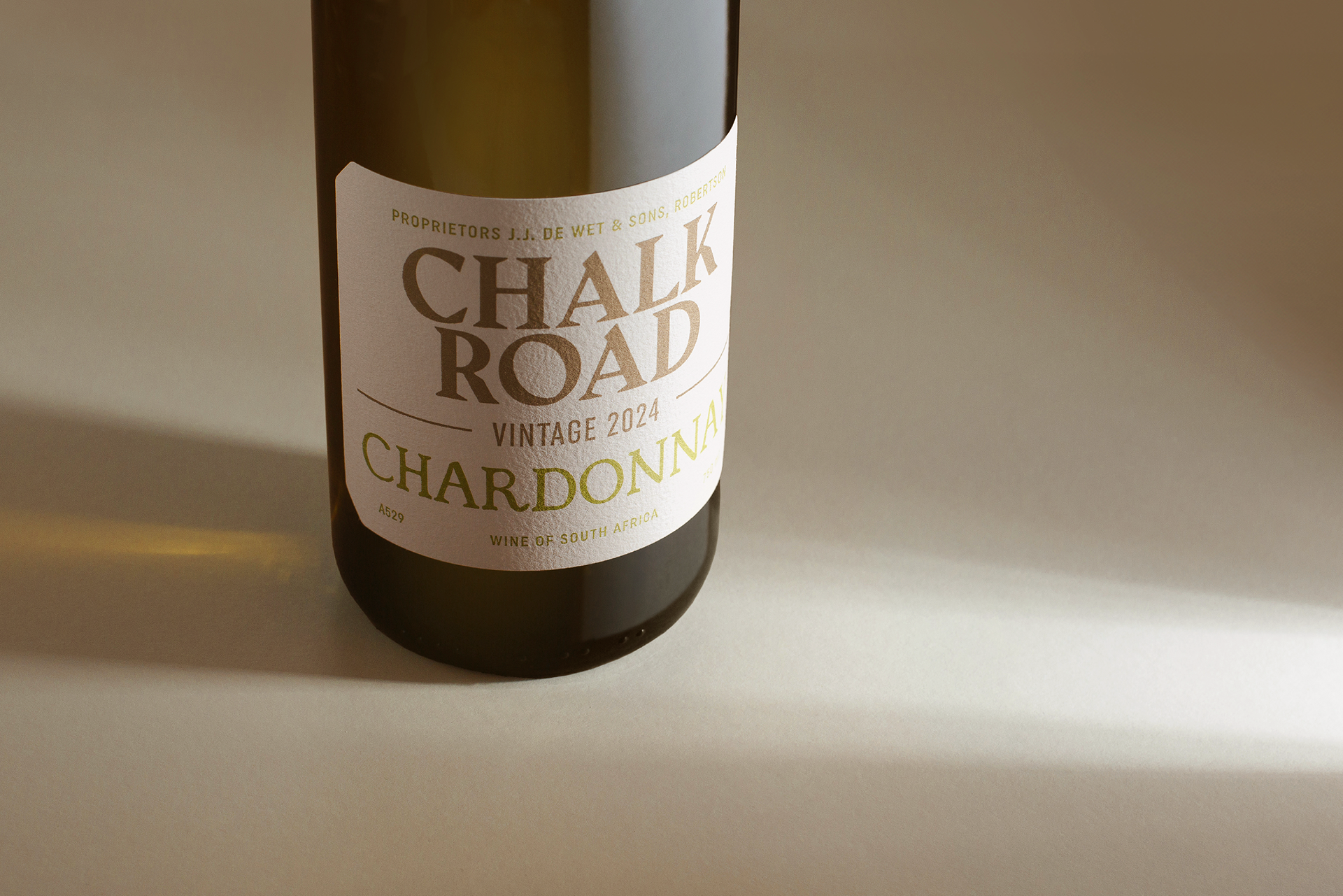
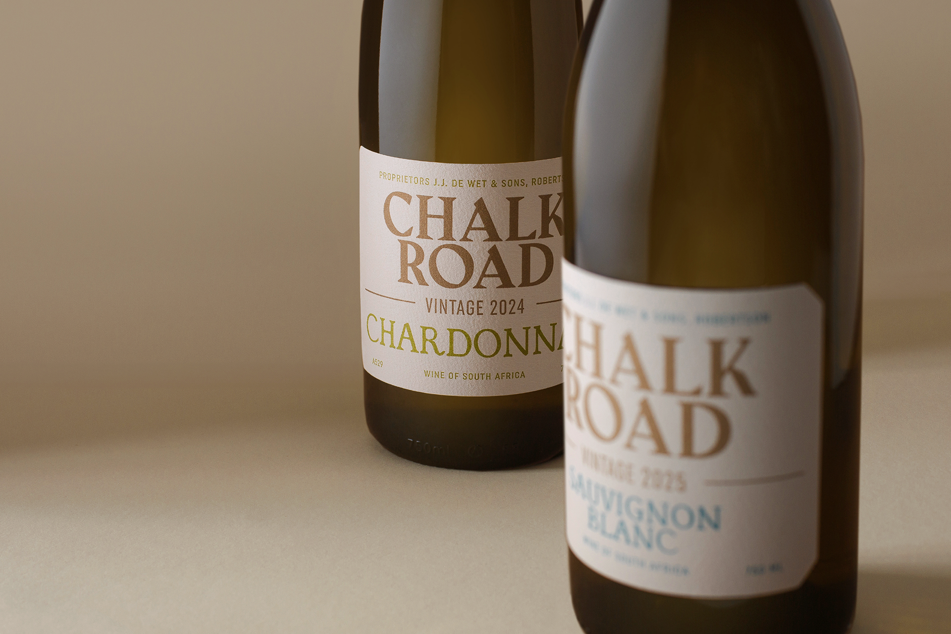
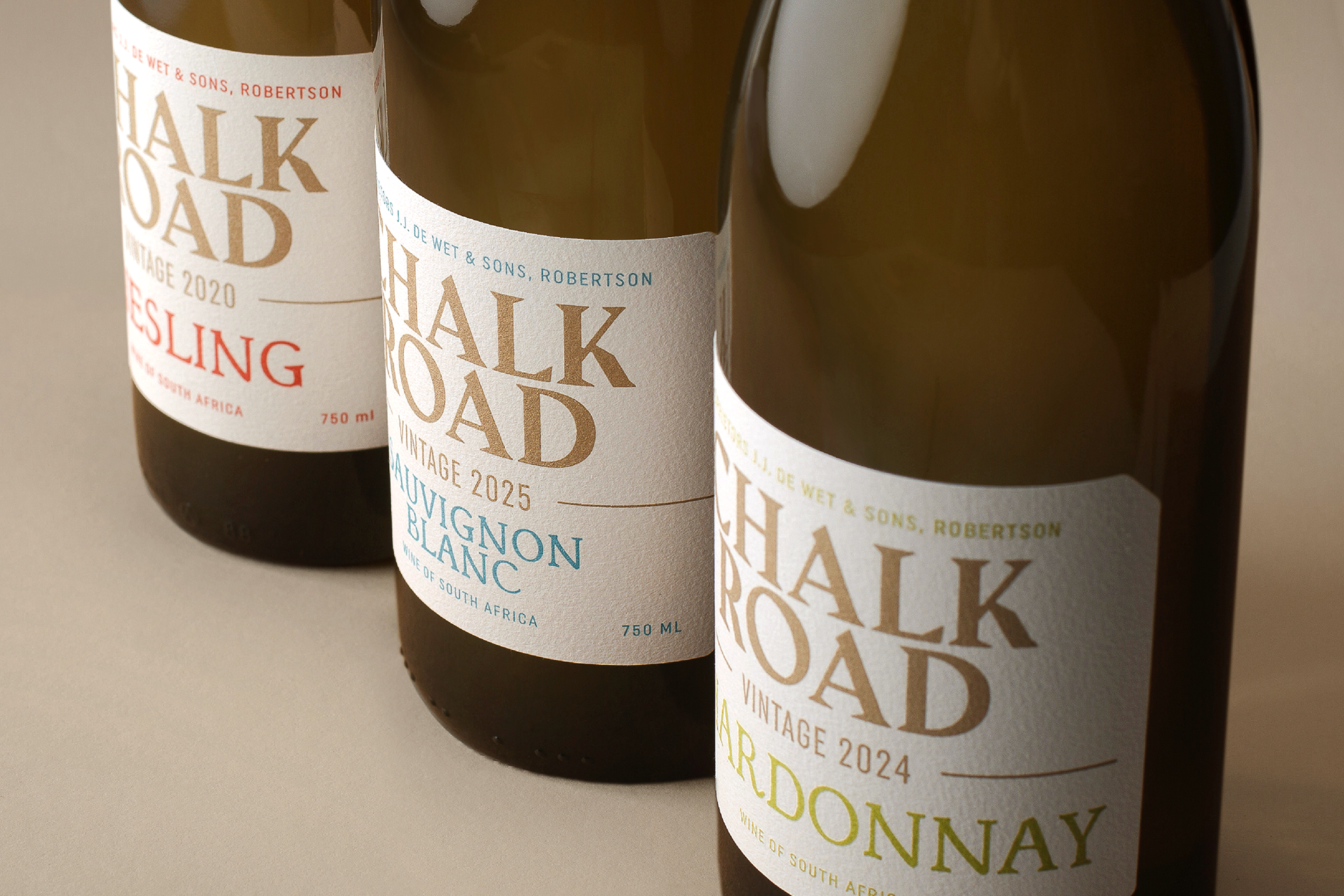
Through careful typographic exploration and a refined layout, we found a balance between structure and simplicity. Soft gold detailing adds quiet warmth and a restrained touch of luxury.
The result is a complete expression built from the light, tone, and texture of place – imagined, now made real.