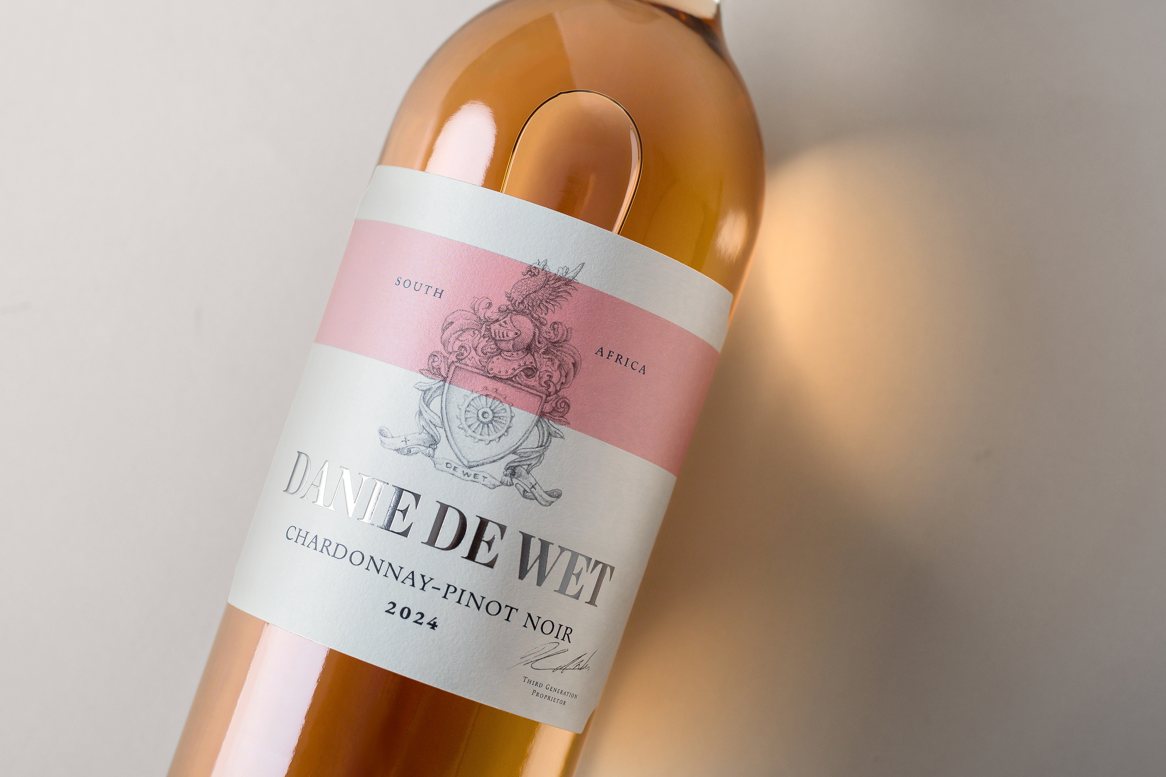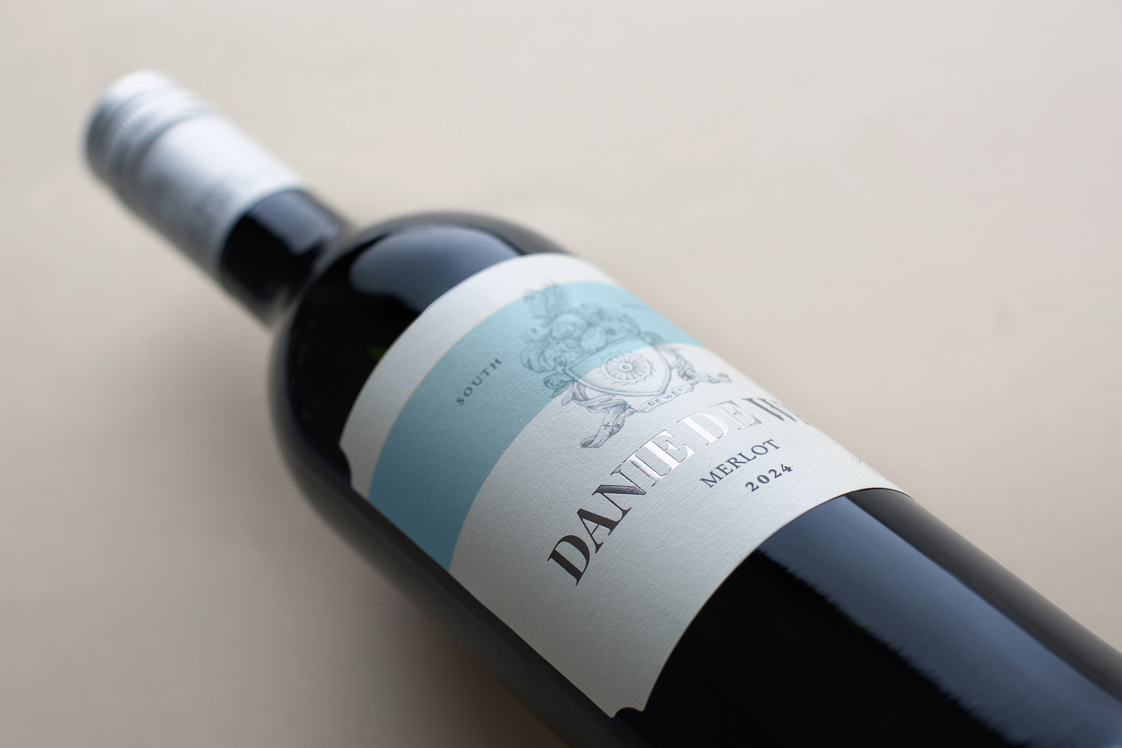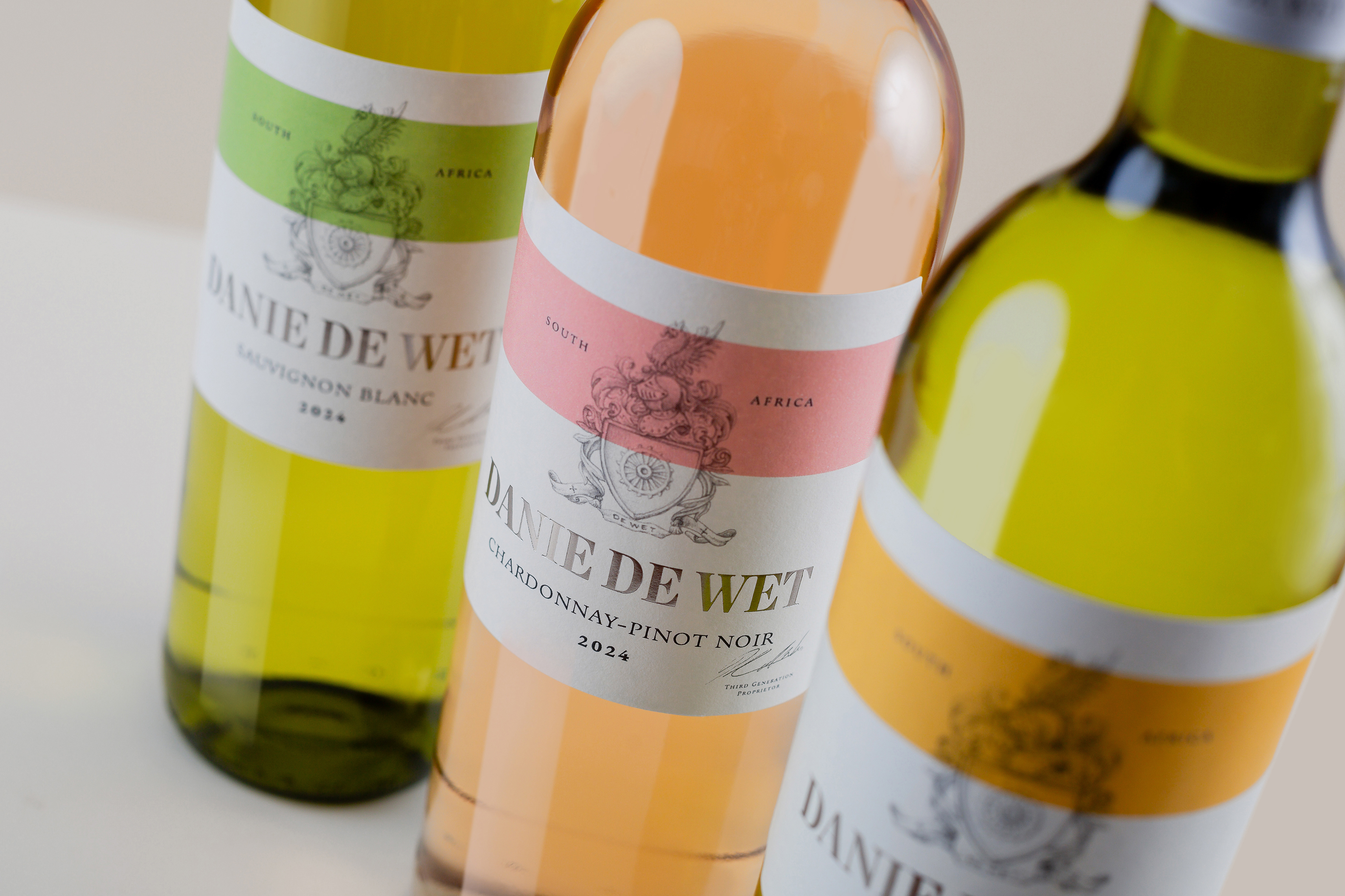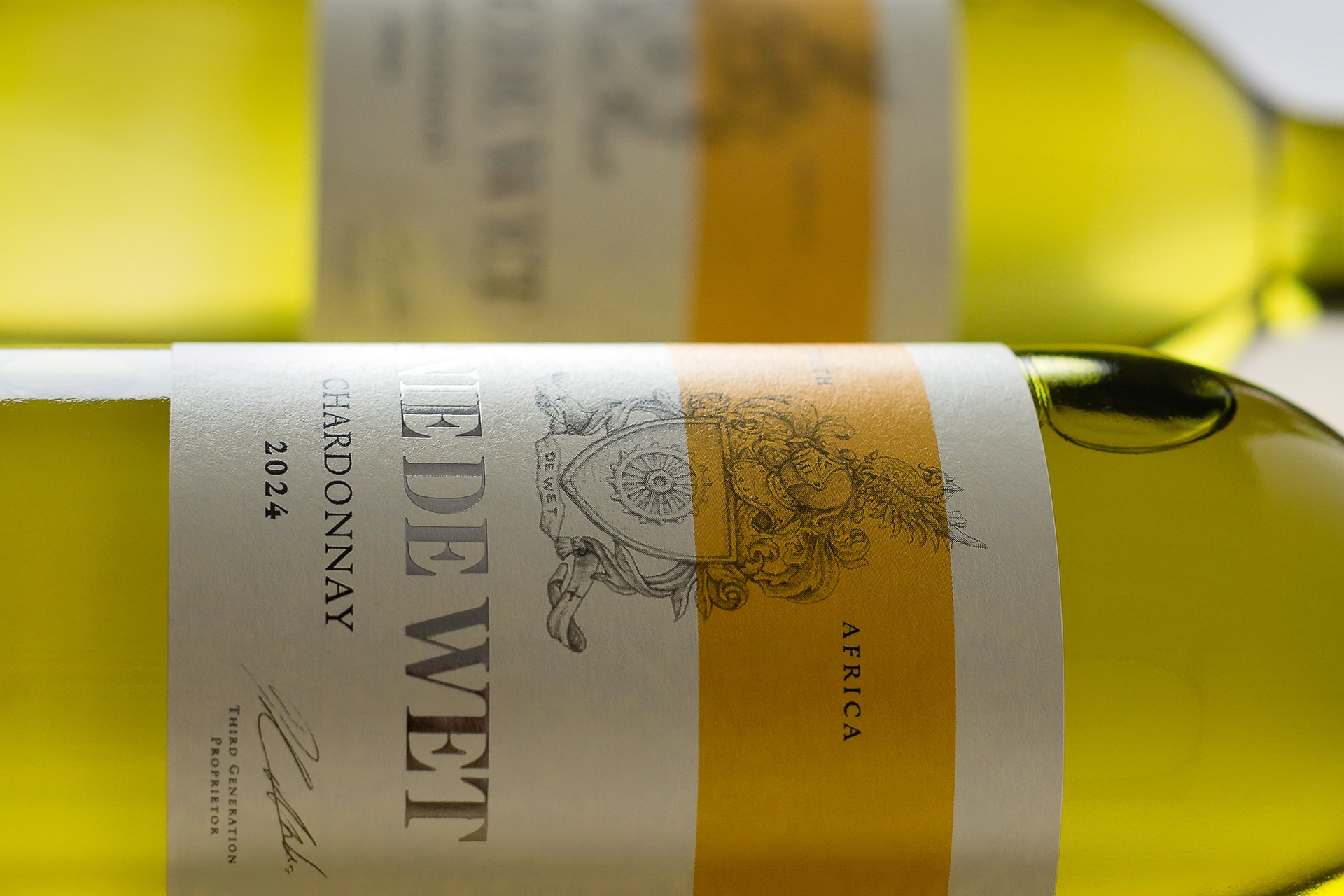
Danie de Wet
Wine Packaging Design | Packaging Upgrade
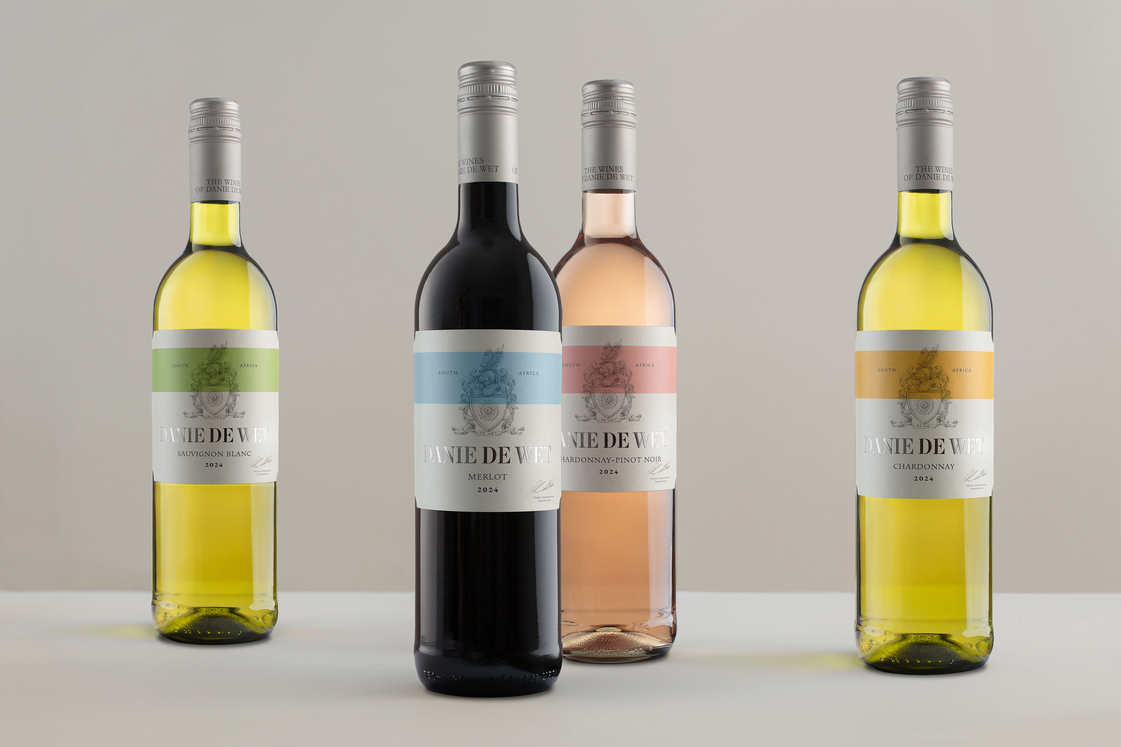
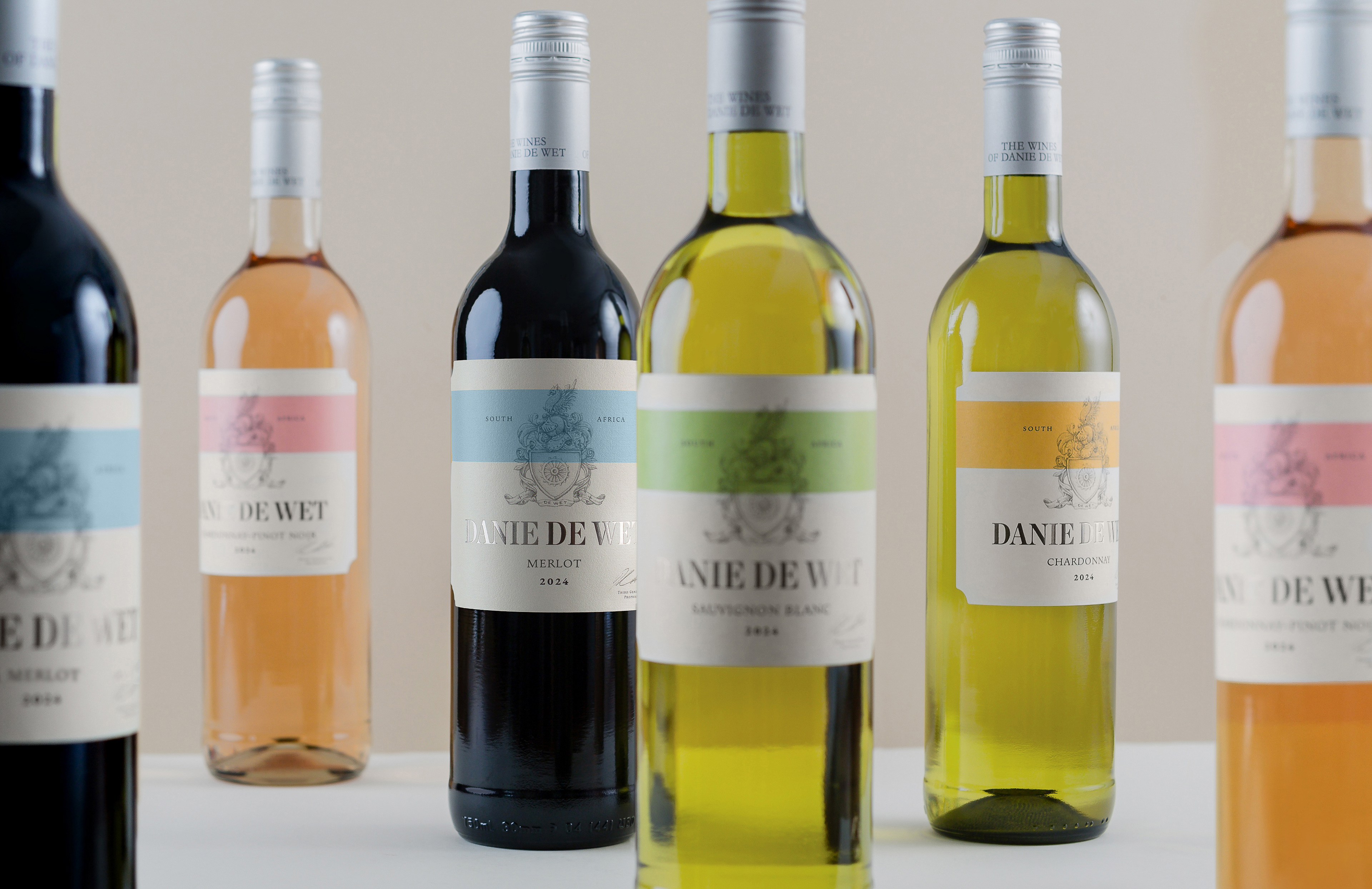
The Danie de Wet range of wines is De Wetshof’s international supermarket offering. Strong shelf standout and easy varietal navigation is vital in a busy and cluttered retail environment.
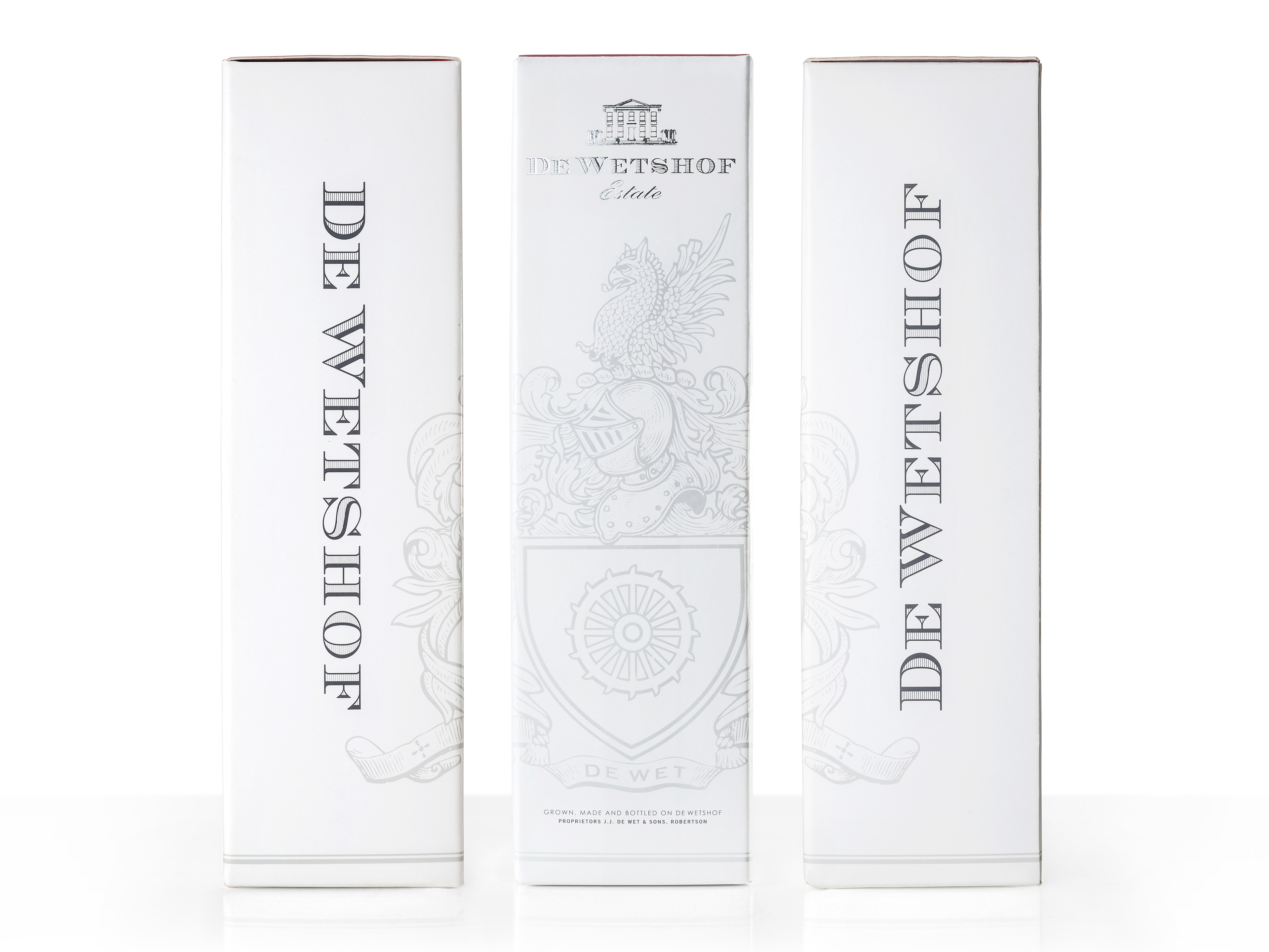
Our challenge furthermore was to create a fresh and contemporary brand that retains an authentic link to De Wetshof.
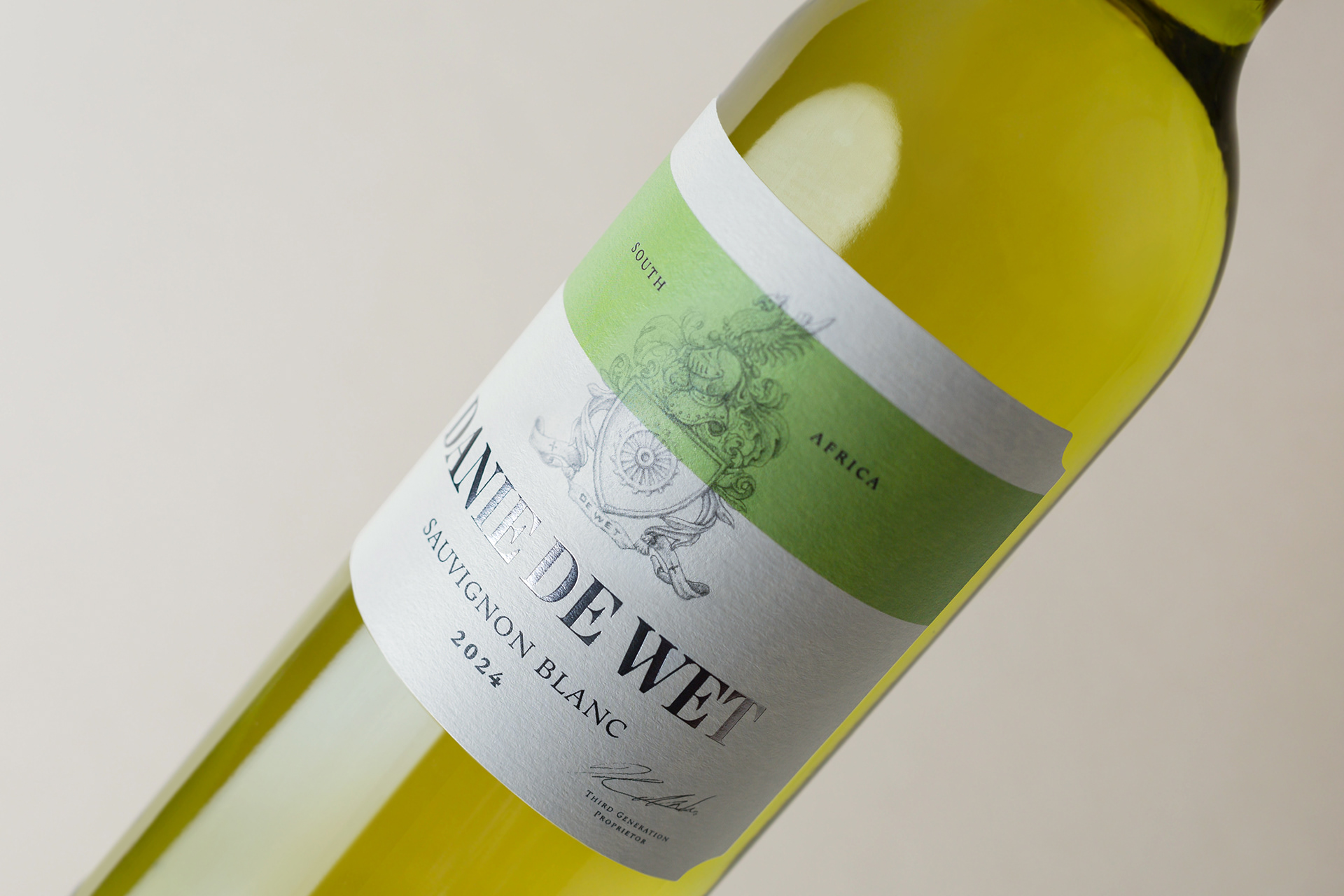
We maintained the classic De Wetshof cut-corners on a crisp white label and hand drew the De Wetshof crest in a loose and more contemporary style offsetting it with a sash, an homage to the French.
The selection of a soft, fresh colour palette brings a delicate translucence to the labels and lifts them off the shelf, while the gunmetal foil logo provides the counterbalance of substance.