Landskroon
Brand Strategy | Packaging Design | Custom Crest Illustration
Following its acquisition by Van Loveren, Landskroon stood at
a moment of transition.
a moment of transition.
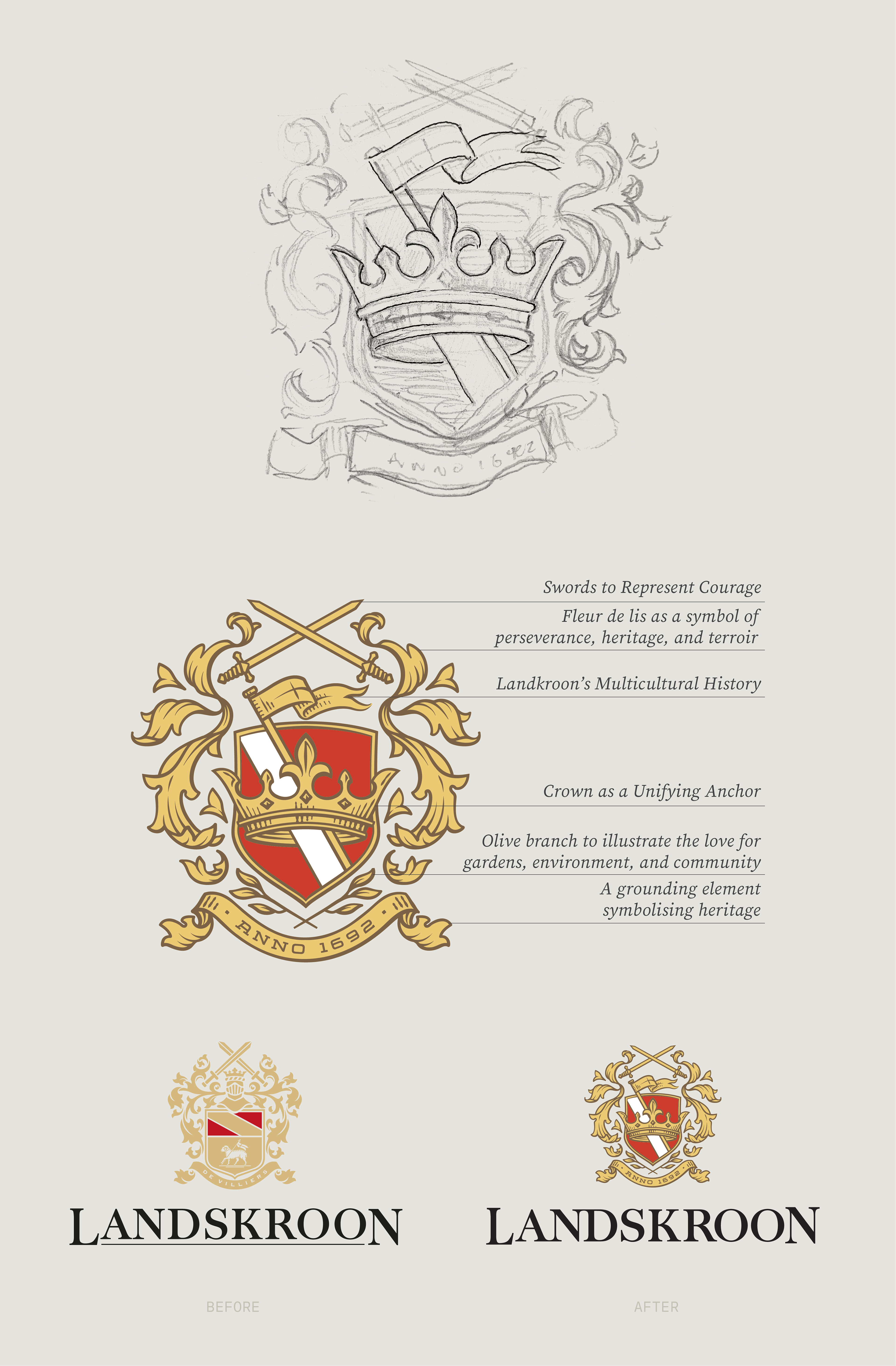
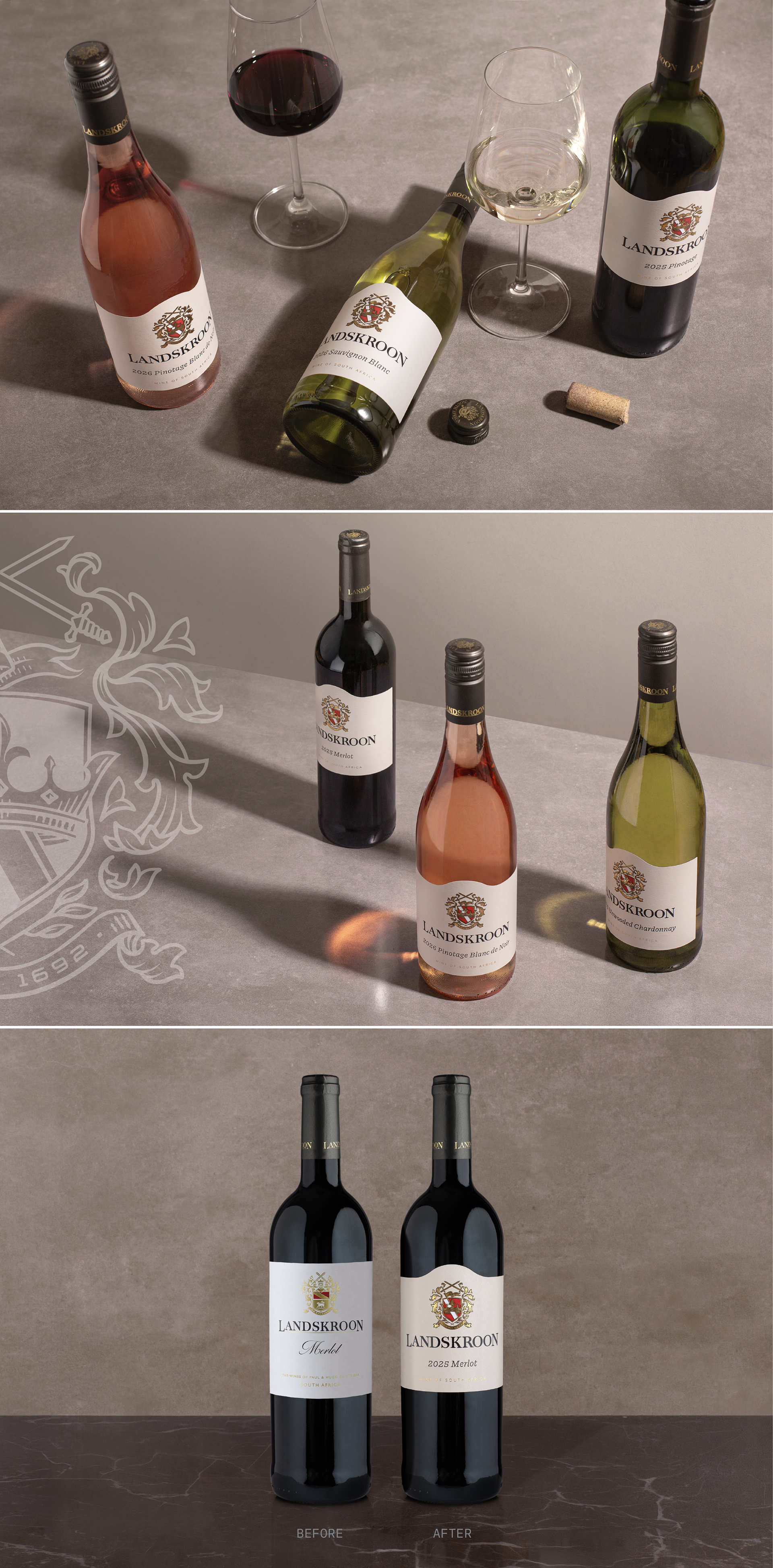
The crest became the vehicle to deepen the story, reimagined to reflect the shared historical and contemporary values of both the De Villiers and Retief families.
We reframed the crown as a defining Landskroon symbol - courage.
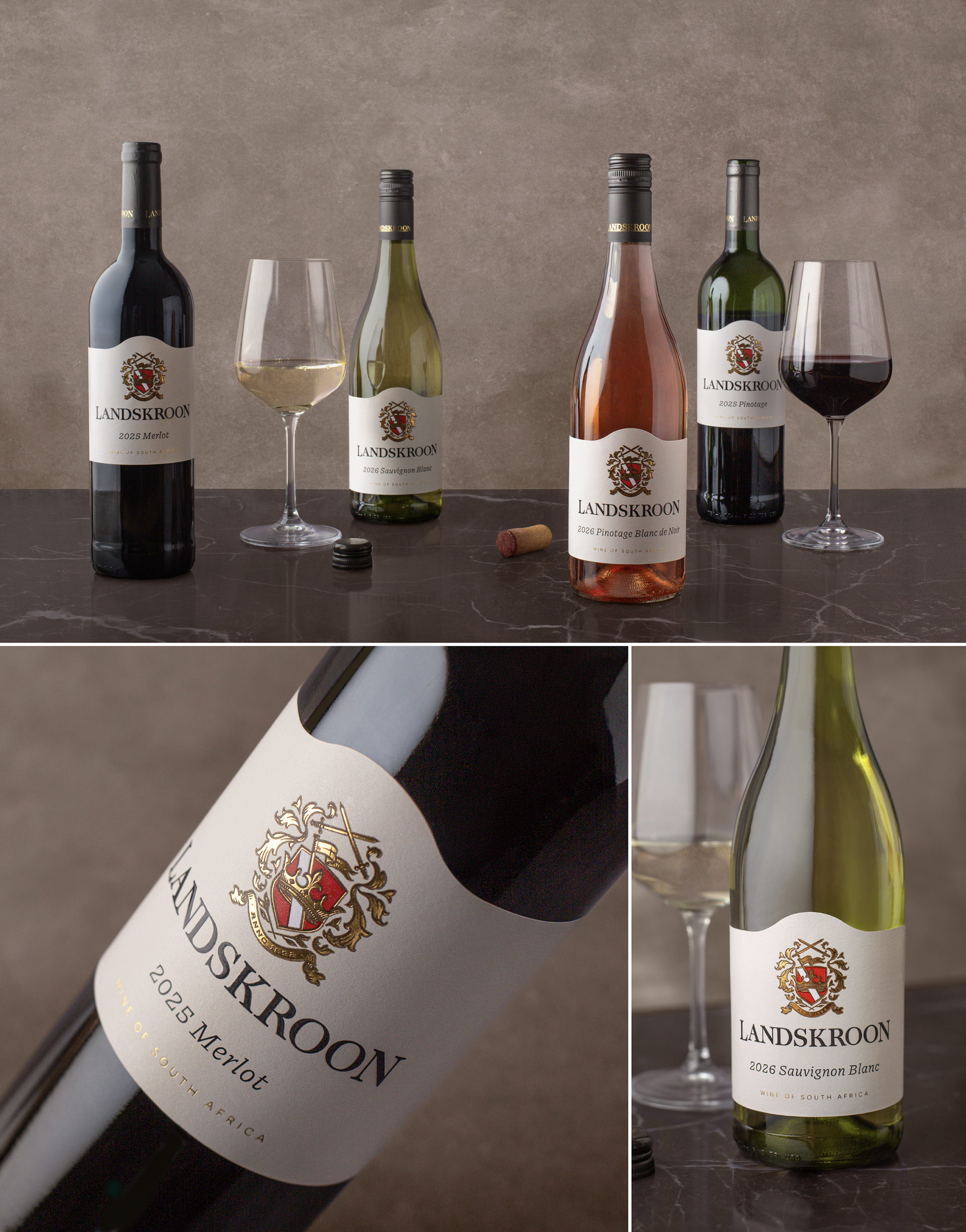
The considered wine label design that followed was created to sit confidently within
the competitive set, with a shaped label structure. The foiled crest, and the colour
red for courage, rewards in hand. It is authentic, tactile and rich with meaning.
A deeper story emerges.
the competitive set, with a shaped label structure. The foiled crest, and the colour
red for courage, rewards in hand. It is authentic, tactile and rich with meaning.
A deeper story emerges.
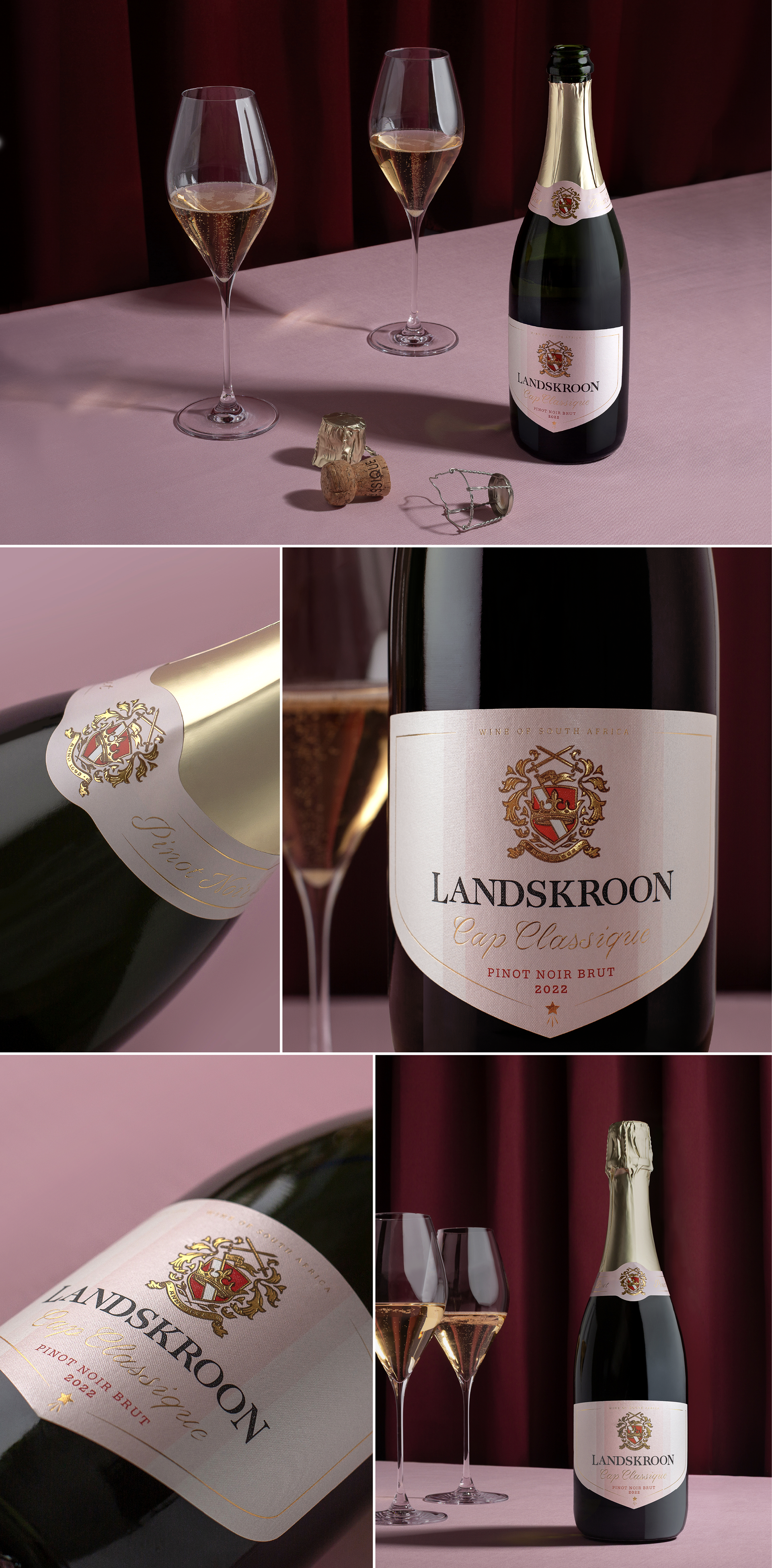
The Cap Classique Pinot Noir Rosé reveals a softer, more nuanced expression,
with layered pink tones and a pearlescent crosshatched paper adding elegance and delicacy to the pack.
with layered pink tones and a pearlescent crosshatched paper adding elegance and delicacy to the pack.
Landskroon redefined - not by changing the story, but by revealing greater depth. Crowned by Courage.